
This document explains what can be styled on your bessa app and which files you (or your designer) need to deliver for it. Hand it directly to your designers — it describes every file and every size in concrete terms.
Format and colour space (applies to all image assets): PNG-24 or JPEG, sRGB colour space, no half-tone or CMYK files. Please also supply vector logos (SVG or PDF) — but only PNGs in the sizes listed below are rendered inside the app.
At a glance: what we need from you
A complete brand delivery consists of:
Required assets
-
Two brand colours — a primary and a secondary colour as hex codes
-
One app icon — a square PNG, 1024 × 1024 px, no transparency
-
One launch image (splash) — a PNG, at least 1242 × 2688 px, no transparency
-
One venue background image — a high-resolution photo that appears behind the venue name and substantially shapes the look of the app
Optional
-
Custom in-app icons — small PNGs for the tab bar, quick actions, action icons, and social icons. Without delivery, we use our default icons (see tables below).
-
Product images for loyalty, redeemable, and orderable items
-
App Store screenshots — if you want to design your own marketing screenshots. Otherwise we generate them automatically from the running app.
The rest of the document explains how these building blocks are used and what to watch out for when designing them.
Three examples: how far you can go
Before getting into the details — three very different brand looks, all built on the same bessa whitelabel system. Two hex colours plus a few asset decisions are enough to create completely different moods.
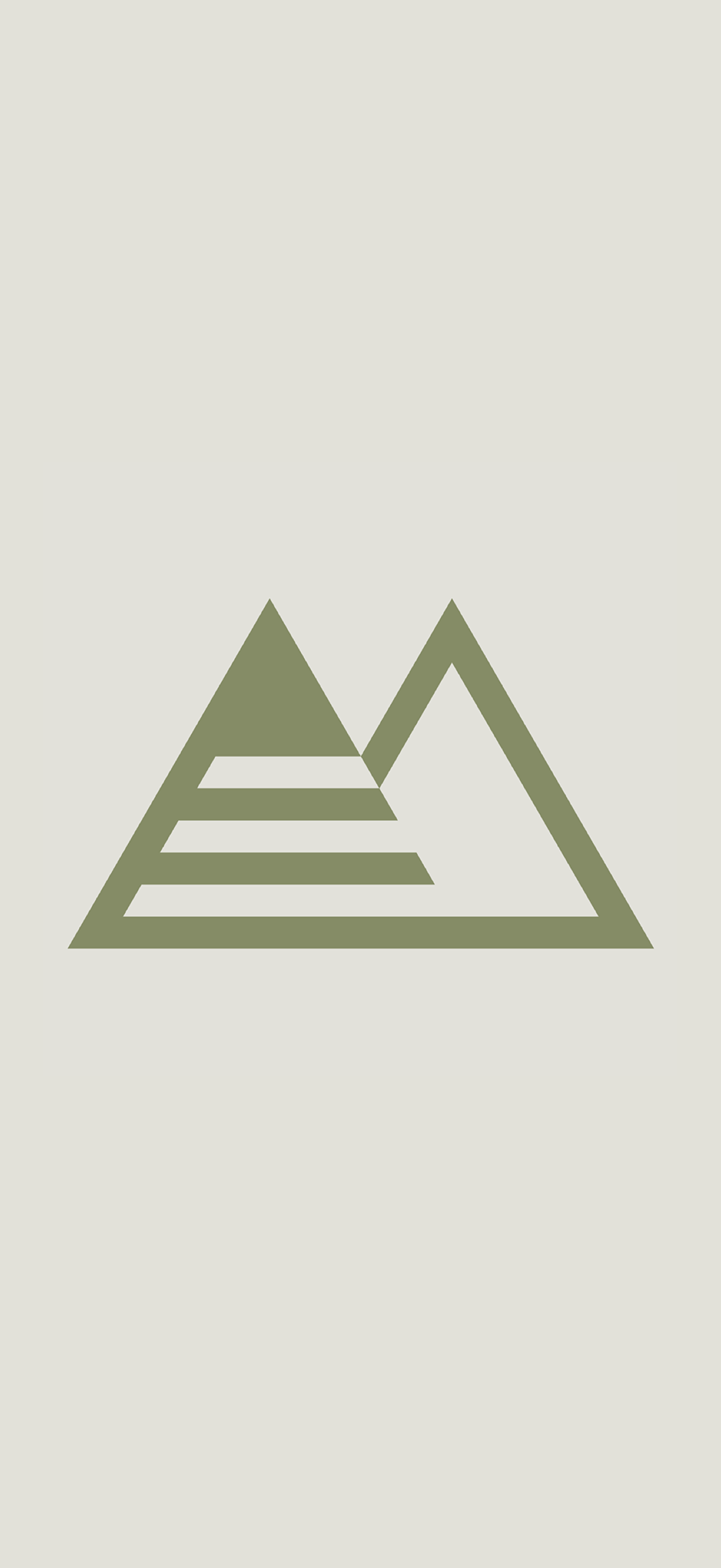
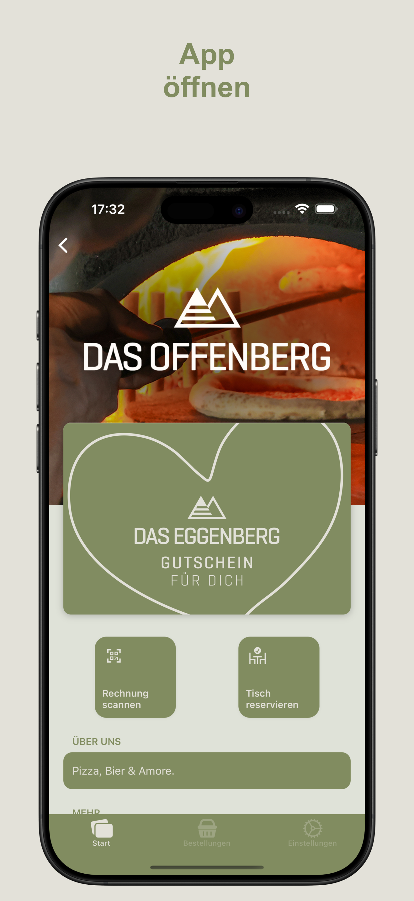
Das Eggenberg — muted, natural, calm
Olive green (#818c60) on warm beige (#e3e1d9). Left-aligned tiles, quiet shadows, an abstract mountain symbol as the brand mark.
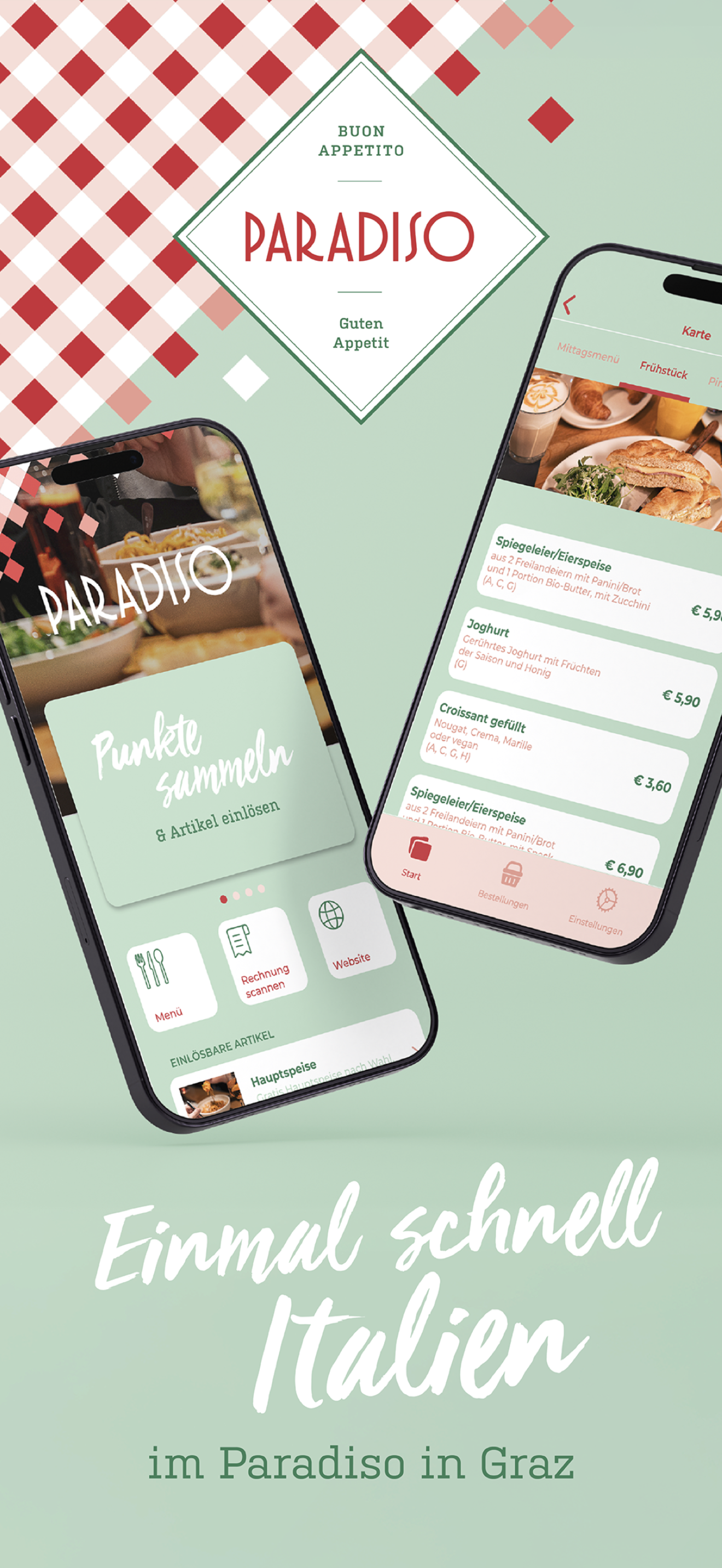
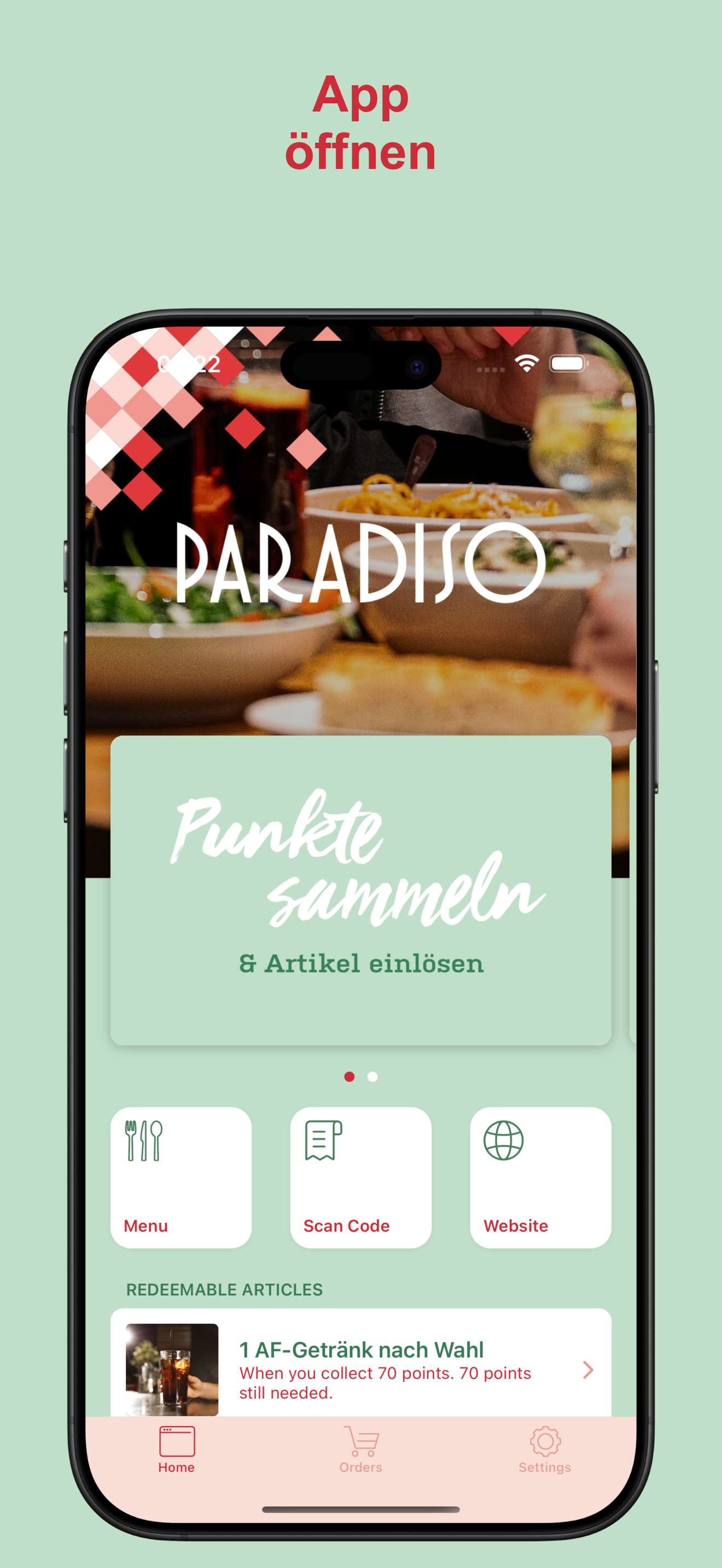
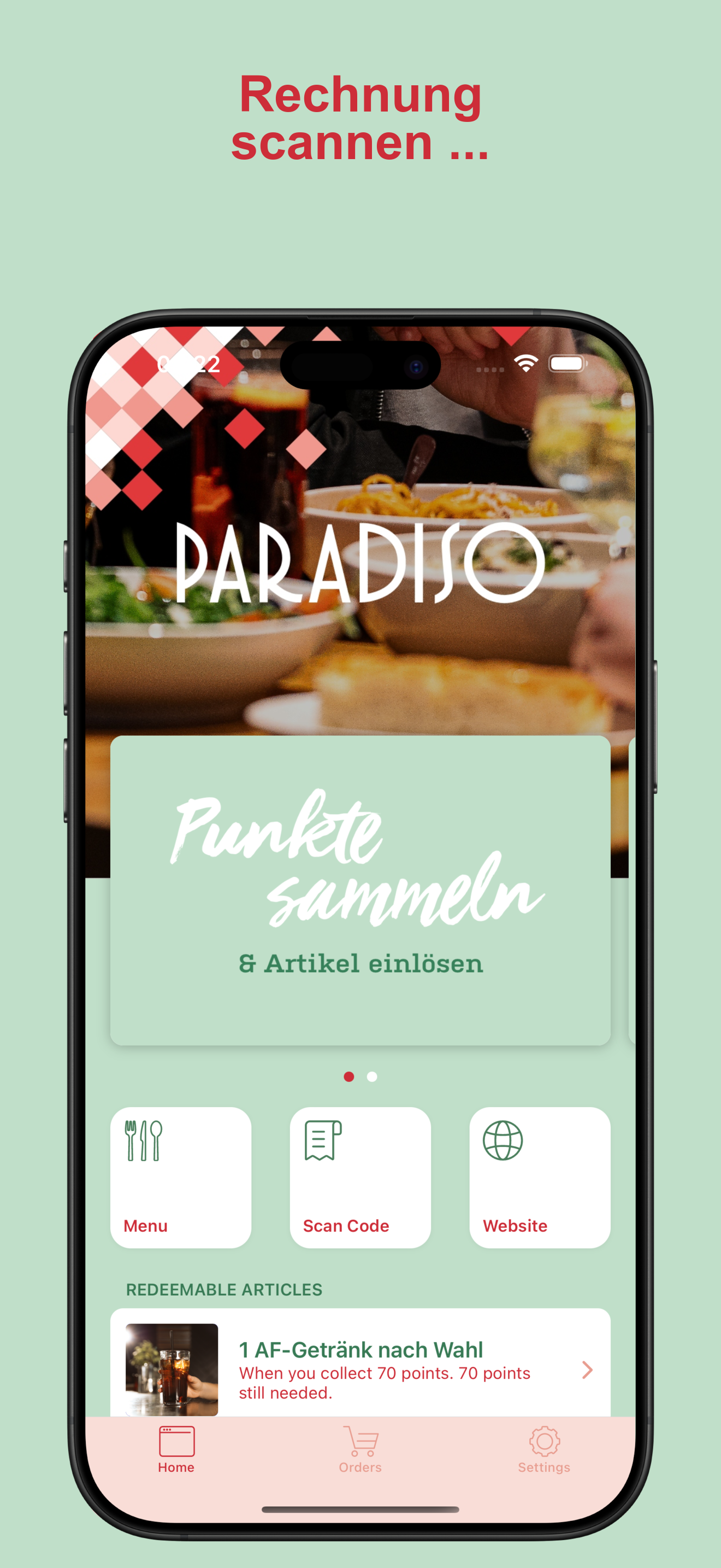
Paradiso — playful, Italian, bold
Tomato red (#cd2d38) as the primary colour, soft sage green (#c0dfc9) as the background, plus pastel pink (#f9ddd7) for the tab bar. Handwritten-style loyalty card headlines and a playful checked pattern shape the look.
Das Leo — premium, black-and-gold, hospitality-forward
Pure black (#0e0e0e) and mustard yellow (#ffd954). Dark theme across all areas, high contrast, clean typography — feels like a high-end bar menu.
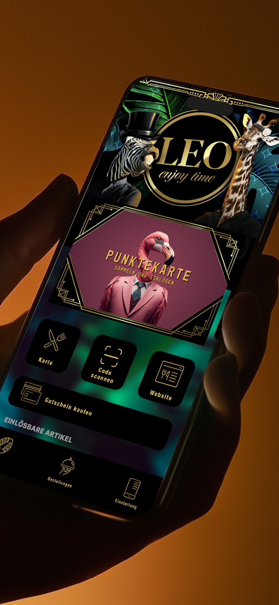
These three brands run the same app code with the same layouts. The entire difference comes from the brand colours and a handful of swapped-out icons.
1. Brand colours
Almost every colour in the app is derived from two hex values you supply:
-
Primary colour (
mainColor) — your main brand colour. Used for buttons, the navigation bar, the tab bar background, accents, badges, the loyalty pass stamp highlight, the cart bar, voucher titles, and most call-to-action surfaces. -
Secondary colour (
backgroundColor/ tile text) — the contrast colour that sits on top of the primary colour (e.g. tile text, navigation text). The app background is a strongly lightened tint of this colour.
Design guidance
-
Pick a primary colour with strong contrast. Text and icons on top of it are rendered either pure white or pure black — chosen automatically by best contrast. Mid-tones (medium grey, muted olive) make this decision hard. Go either clearly dark or clearly light. To check, use the WebAIM Contrast Checker — target at least 4.5:1.
-
The secondary colour should work when lightened. The app background is the secondary colour lightened by about 85 % (nearly white with a hint of the brand). A bold secondary colour becomes a very pale tint — make sure that pastel still feels on-brand.
-
Avoid two colours with the same brightness. Primary and secondary must contrast with each other — tile text uses the secondary colour on a primary surface. If both are dark, the text disappears.
-
Think about the status bar. The system symbols (clock, battery, signal) switch automatically: dark primary colour → light status bar, light primary colour → dark status bar.
What can still be fine-tuned later
The two-colour formula provides a coherent starting point — but every individual screen colour can be overridden afterwards. A dedicated sheet theme, a custom cart colour, different shadows, or a different voucher highlight are all possible at any time.
Everything that can be themed
The app is divided into "blocks". Each block has its own colour values. You can derive everything from the two brand colours or selectively override individual areas:
|
Area |
What can be adjusted |
|---|---|
|
Top navigation bar |
Background, title, back arrow |
|
Bottom tab bar |
Background, active tab colour, inactive tab colour |
|
Home tiles |
Tile background, tile text, secondary text, header, tap selection, divider, badges, icon tints, shadows |
|
Venue list |
Card text, refresh spinner |
|
Venue detail |
Title tint, optional hero background image |
|
Login / sign-in |
Background, text, activity indicator, close button, optional top gradient, Apple button style |
|
Magic-link login |
Background, title, message, input field, button |
|
Menu / ordering |
Search-bar mode (light/dark), category colours, cart bar, footer link, radio buttons |
|
Cart |
Footer background and text, optional stepper buttons, tip indicator, payment-method styling |
|
Bottom sheets |
Background, title, divider |
|
Picker (quantity / time) |
Gradient from / to, text colour |
|
Stepper (+ / − buttons) |
Text colour |
|
Push toast |
Background |
|
Loyalty pass card |
Stamp position (front), title + subtitle (front), details + info (back), redeem button, pagination dots |
|
Shadows |
Card and tile shadows are full styles (offset, colour, opacity, radius, Android elevation) |
|
Voucher screen |
Item title, subtitle, highlight |
|
Redeem button |
Full button style |
|
Settings |
Icon tint |
|
Status bar (per screen) |
Light or dark — per individual screen |
Two design decisions we often discuss:
-
Tiles left-aligned or centred. Some brands feel more editorial-clean left-aligned, others prefer centred. One decision per app.
-
Shadow depth is brand expression. A very modern, soft brand may prefer barely visible shadows; a more traditional brand prefers deeper ones. Card and tile shadows are independently controllable.
2. App icon
Delivery: one PNG, 1024 × 1024 px, square, no alpha channel / transparency.
The binding icon requirements are maintained by the providers themselves and change over time. Check the official sources before designing: Apple Human Interface Guidelines: app icons and Google Play: icon design specifications.
From this single file we automatically generate every size needed — from the 1024 px store icon down to the 40 px notification icon. iPhone and Android use the same source.
Design guidance
-
No transparency. Apple rejects icons with an alpha channel. Fill the corners — the system rounds them at runtime.
-
No text-heavy icons. At 40 px the icon is tiny. A wordmark that works at 1024 px becomes unreadable at 40 px. Use a strong symbol or monogram.
-
No baked-in drop shadow. The operating system renders its own shadows. Built-in shadows look dated.
-
Safe area. Keep important imagery within the central ~80 % — the outer 10 % can be visibly cropped on Android with adaptive icons.
3. Launch image (splash)
Delivery: one PNG. At least 1242 × 2688 px (iPhone XS Max resolution). Larger is fine — we scale down.
Apple's launch-screen guidance changes over time — the official source takes precedence: Human Interface Guidelines: launching.
Users see this image for about one second when the app starts.


Design guidance
-
No transparency. The image is also reused as the first App Store screenshot; transparency causes upload errors there.
-
Composition for many screen sizes. The image is shown edge-to-edge on every iPhone size (iPhone SE through Pro Max) and every Android device. Keep the key element (logo, brand mark) centred with generous breathing room on all sides.
-
It should feel like an extension of the brand colour. The splash transitions directly into the login or home screen, which uses your primary and secondary colours. A splash in completely different colours feels like a break.
4. Custom in-app icons (optional)
If you want to outfit the app interior with your own icons, deliver the file list below. Without delivery, our default icons are used — they are good, but generic.
Each icon is delivered in three resolutions: @1x, @2x, and @3x (the @3x variant is the source; the others are downscaled versions). The pixel sizes given below are the @1x base value — @2x is twice as large, @3x three times.
File-name convention: Apple standard with suffix: tabbarIconHome.png (@1x), tabbarIconHome@2x.png (@2x), tabbarIconHome@3x.png (@3x). Please use exactly this notation — case-sensitive, no spaces or special characters.
Tab-bar icons (at the bottom edge)
|
Default |
Name |
Size |
Size |
Notes |
|---|---|---|---|---|

|
|
32 × 32 px |
96 × 96 px |
inactive state |

|
|
32 × 32 px |
96 × 96 px |
active state (filled variant) |

|
|
32 × 32 px |
96 × 96 px |
inactive |

|
|
32 × 32 px |
96 × 96 px |
inactive |
Only Home currently has its own selected variant. For tabbarIconOrders and tabbarIconSettings, the plain variant is automatically tinted when the tab is active.
Designer note: deliver these as single-colour PNG silhouettes on a transparent background. The app tints them at runtime. No fills, no gradients.
Quick-action icons (on the home tiles)
|
Default |
Name |
Size |
Size |
Notes |
|---|---|---|---|---|

|
|
32 × 32 px |
96 × 96 px |
scan code |

|
|
32 × 32 px |
96 × 96 px |
open menu |

|
|
32 × 32 px |
96 × 96 px |
reserve table |

|
|
32 × 32 px |
96 × 96 px |
external website |
Action icons (venue detail)
|
Default |
Name |
Size |
Size |
Notes |
|---|---|---|---|---|

|
|
24 × 24 px |
72 × 72 px |
call |

|
|
24 × 24 px |
72 × 72 px |
|

|
|
24 × 24 px |
72 × 72 px |
directions |

|
|
24 × 24 px |
72 × 72 px |
address |

|
|
24 × 24 px |
72 × 72 px |
phone number |

|
|
24 × 24 px |
72 × 72 px |
about us |

|
|
24 × 24 px |
72 × 72 px |
info |

|
|
24 × 24 px |
72 × 72 px |
opening hours |

|
|
24 × 24 px |
72 × 72 px |
pricing |
Social icons
|
Default |
Name |
Size |
Size |
Notes |
|---|---|---|---|---|

|
|
24 × 24 px |
72 × 72 px |
|

|
|
24 × 24 px |
72 × 72 px |
|

|
|
24 × 24 px |
72 × 72 px |
TikTok |

|
|
24 × 24 px |
72 × 72 px |
X / Twitter |

|
|
24 × 24 px |
72 × 72 px |
YouTube |
Decorative assets
|
Default |
Name |
Size |
Size |
Notes |
|---|---|---|---|---|

|
|
42 × 42 px |
126 × 126 px |
tiled background pattern on the loyalty pass card |

|
|
approx. 24 × 24 px |
approx. 72 × 72 px |
placeholder icon for vouchers (square or slightly portrait) |

|
|
48 × 48 px |
144 × 144 px |
placeholder for food items without an image |

|
|
48 × 48 px |
144 × 144 px |
placeholder for drinks without an image |
General icon guidance
-
Consistent stroke width. All icons should share the same line weight (1.5 px or 2 px at
@1xis typical). -
Single colour, transparent background. The app tints icons in brand colours. Coloured icons do not adapt and feel out of place.
-
Optical balance over mathematical centring. A 32 × 32 bounding box does not mean the icon must fill the box — a circle feels heavier than a square at the same size. Trust the eye.
-
Active and inactive variants should match. If you deliver
tabbarIconHomeSelected, it should visually pair withtabbarIconHome(outline vs. fill is the usual pattern).
5. Venue background image
This image is required — it is the most visually dominant element on the venue detail page and sits behind the venue name and address. A weak or missing choice is immediately noticeable.
-
Format: PNG or JPG (sRGB)
-
Recommended size: at least 1500 × 1500 px, square or portrait. The app shows the image at full screen width — a clearly wider-than-tall image will be cropped at top and bottom.
-
Composition: the venue name and address sit on top of this image — so keep the upper third quiet. A high-contrast photo there makes the text unreadable. A subtle vignette or a darker gradient at the top helps.
The image applies per app, not per venue — it appears across all venues of a business.
6. Loyalty pass card
The loyalty pass card has a front and a back:
-
Front: the stamp grid + card title and subtitle, plus a redeem button as soon as the customer has earned a reward.
-
Back: card details + info area for terms.
Both sides inherit your brand colours automatically. You can selectively override the title font, subtitle font, stamp position, and redeem button style — typical adjustments are moving the stamp position by a few pixels or a redeem button in a deviating colour.
7. Product images
So that the menu and loyalty pass do not feel generic, deliver an image for each product where possible.
|
Use case |
Recommended size |
|---|---|
|
Redeemable items (e.g. free coffee) |
at least 256 × 256 px, square |
|
Orderable items on the menu |
at least 256 × 256 px, square |
|
Category hero images (e.g. "Coffee", "Pizza") |
1200 × 400 px, aspect ratio 3:1 |
Formats: JPG or PNG, sRGB. We compress further internally; deliver the sharpest version you have. For category images, please mind the aspect ratio — deviating formats are cropped.
8. App Store and Play Store screenshots
You do not have to design these yourself — by default we generate the screenshots automatically from the running app, with your brand colours as the frame. If you want to design your own marketing screenshots, use the sizes below.
Automatic variant: we generate at least 5 screenshots per device type. The background of each screenshot is your secondary colour, the headline above it is your primary colour, and the first image is your launch image inside an iPhone frame.
Sizes for your own screenshots
The size, format and number of store screenshots are defined by Apple and Google themselves and change regularly. The official specifications always take precedence — check them before every delivery:
Deliver the largest required variant per store as PNG or JPEG with no alpha channel — we scale down as needed.
Examples
This is what our automatically generated feature screens look like (the splash variant as the first store image is shown above under Three examples):
9. What you do not have to design
So it is clear what sits on our side and does not need to be delivered by your designer:
-
App layout, navigation structure, screen flow
-
Typography (the app uses the system font)
-
Animations and transitions
-
Shape of UI elements (button corner radii etc.)
-
Localisation (we handle German and English)
-
App Store / Play Store metadata copy
If you have strong opinions on any of these — talk to us. Some things can be adjusted on request; others are kept deliberately consistent across all whitelabel apps so that operation stays familiar.
10. Delivery checklist
When you hand over your assets, please send them as a single folder or drive link:
-
[ ] Primary colour (hex, e.g.
#FFD954) -
[ ] Secondary colour (hex, e.g.
#0E0E0E) -
[ ] App icon: 1024 × 1024 PNG, no transparency
-
[ ] Launch image: ≥ 1242 × 2688 PNG, no transparency
-
[ ] Venue background image (≥ 1500 × 1500 px, sRGB)
-
[ ] (Optional) custom in-app icon set from section 4, each as
@1x/@2x/@3x, transparent background, single colour -
[ ] (Optional) tab-bar icons:
tabbarIconHome,tabbarIconHomeSelected,tabbarIconOrders,tabbarIconSettings -
[ ] (Optional) quick-action icons:
quickActionScan,quickActionMenu,quickActionBooking,quickActionWebsite -
[ ] (Optional) action icons (9 files) and social icons (5 files) from section 4
-
[ ] (Optional) decorative assets:
Background,coupon,food,drink -
[ ] (Optional) block-level colour overrides from the table in section 1 (otherwise the two brand colours are used everywhere)
-
[ ] (Optional) loyalty pass adjustments (custom stamp position, title/subtitle styling, redeem button colour)
-
[ ] (Optional) product images for menu, redeemable items, and categories
-
[ ] (Optional) custom App Store and Play Store screenshots in the sizes from section 8
Please name the icon files exactly as in the tables above — then we can integrate them without follow-up questions.
Related topics
-
Set up whitelabel app — how to commission the finished app from bessa and publish it to the app stores
Questions or unclear bits? Write to us at support@bessa.app. We are happy to help with colour decisions or with an initial design proposal.