
In this part of the documentation we go through the individual menu items that are available and that allow you to configure the various bessa modules.
General
Navigation
Using the search field in the top left corner, you can select a company that you want to modify. If you have only created one company in bessa, the search function cannot be used.
If you have multiple venues, you can switch the currently active venue using this navigation field.
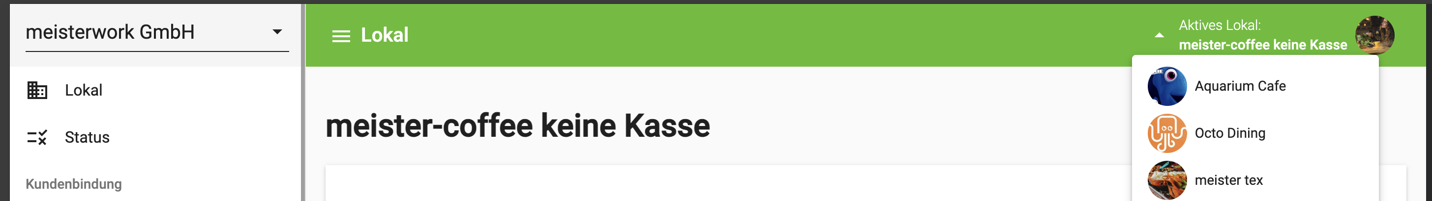
1. Venue
Here you can change the master data for your venue; this data is then displayed in the whitelabel app and in the web shop.
-
Company data such as name, e-mail, etc.
-
Background image for the app and the web shop.
-
Social media – here you can change your social media profiles.
-
Opening hours.
2. Status
Here you see a brief summary of what still needs to be done so you can use our bessa products. Once everything is done, the success bar is 100% green.
Customer Loyalty
In their whitelabel app and in our bessa app, we offer customers promotions and loyalty cards. With these, the customer can be tied to the company, and customers can be more strongly motivated with promotion cards.
Customer loyalty also works without a whitelabel app or ordering module, but in that case not all cards listed in this documentation can be used.
1. Bonus Cards
A loyalty pass or collector card is used to reward customers who regularly visit the venue or order there regularly. We distinguish between 2 types of collector cards.
-
Points card – with this card, points are collected. The points are calculated from the order total. Usually 1 euro = 1 point, but this can be changed by the bessa team on request.
-
Stamp card – with this card, stamps are collected; one stamp per article applies.
This documentation shows you how to create such a card.
-
Log in to bessa Manager.
-
In the menu on the left, select Promotions.
-
You will now see a list of your existing promotion cards, or, if you haven't created any yet, the list is empty. To create a new promotion card, click the + New Bonus Card button.
-
In the menu that opens, you can choose between a points card and a stamp card.
After choosing the card, a new dialog opens where you can configure it. The settings for Details, Articles and Design are the same for both collector cards. We first cover the shared settings before going into the differences between the two collector cards.
General Settings
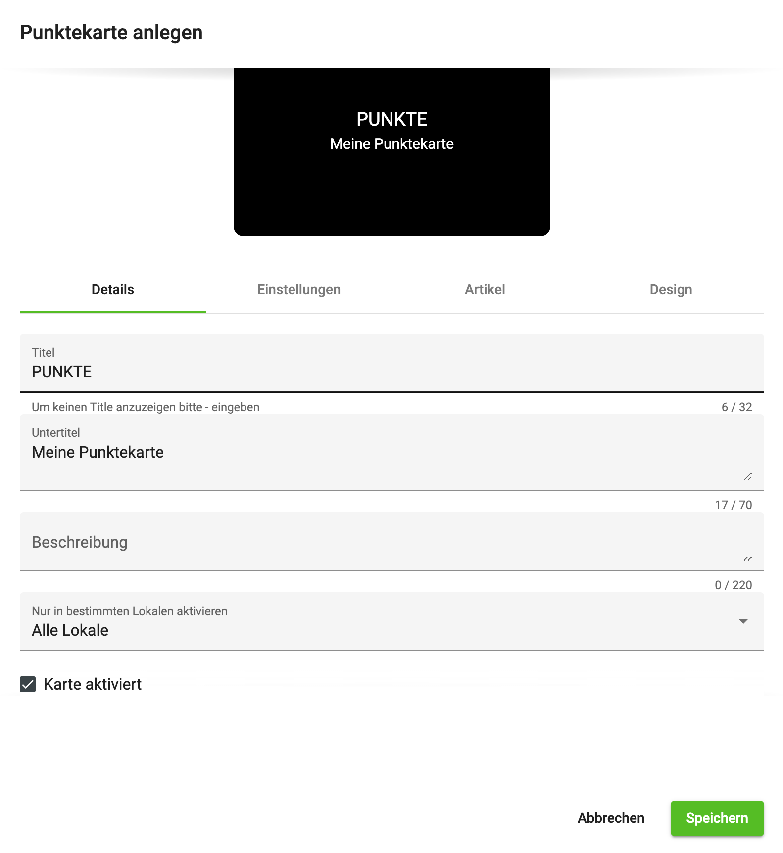
In the first Details tab you can make the following settings.
Title – in this field you can define a title that is shown to the app user; if you don't want a title, write a - in the field.
Subtitle – in this field you can add a short text, which is shown centred under the title.
Description – in this field you can define a description for the promotion card; this is seen by the user when they tap the card in the app, which then flips and shows the text.
Activate only in specific venues – in our system it is possible for customer loyalty cards to be used across multiple venues simultaneously. If this is not desired, you can restrict the card to specific venues.
Card activated – with this action you can deactivate the card at short notice.
Article Settings
The articles selected here restrict the collector card to those selected articles. If no articles are entered here, the points or stamps for the order are calculated from the order total. If articles are entered, e.g. "A beer collector card", points or stamps are only collected for those articles entered in the list.
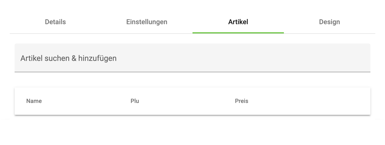
Follow the instructions to select an article for the collector card.
-
Click into the field Search & add article
-
Enter the PLU or the name of the article
-
A drop-down menu appears; select the desired article
-
The article then appears in the article list under the search field.
Design Settings
These are analogous to the design settings of the promotion cards. → Design Settings
Points Card Settings
Collecting points depends on the article settings and on the following settings. The points are calculated from the order amounts. If articles are entered, only the net amounts of those articles are collected per order.
An example: a pizza collector card collects points only for pizzas. An order is placed with 3 pizzas (€10) and 2 salads (€5) and several drinks. As a result, 30 points are collected.
Collected points
The collected points of the points card can be redeemed via redeemable articles. → Redeemable Articles. There is also the option to use the discount features of the promotion card to give the customer a benefit.
Settings
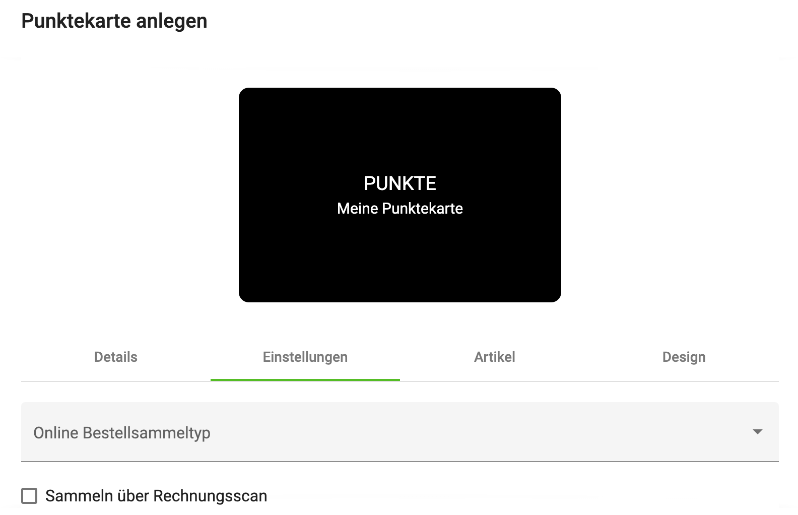
Online order collection type – it is possible to restrict the collection of points to one of the order types.
Collect via invoice scan – the app user can scan the QR code of a paper invoice, and points are collected through this.
Loyalty Pass / Collector Card Settings
With this card you can collect stamps for the articles listed in the Articles tab. 1 article = 1 stamp.
If the stamp card is full, the app user can redeem one of the articles released for collection.
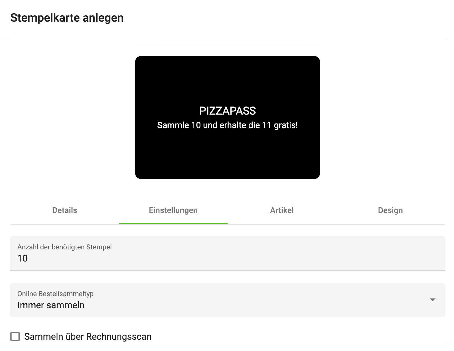
Number of stamps required – with this field you specify how many articles the customer must collect before they can redeem one for free.
Online order collection type – it is possible to restrict the collection of stamps to one of the order types.
Collect via invoice scan – the app user can scan the QR code of a paper invoice, and stamps are also collected through this.
2. Redeemable Articles
In this Manager menu item, you specify which articles can be redeemed for the collected points (of the points card).
If you want to add another article to this list, click on + Add points to article. The click opens the following dialog.
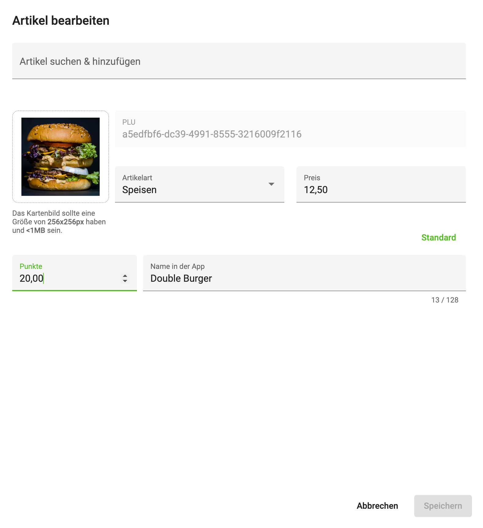
First find an article via the "Search & add article" field. After you have selected an article, it is shown in the dialog as above.
Points – with this field you specify how many points an app user must collect before they can redeem this article.
Article image – here you can set an image for the article, which is then shown in the app.
Name in the app – with this field you can override the name of the article; this name is then shown in the app.
Article type – with this field you can change the article type.
Price – with this field you can change the price.
Article data cannot always be changed; if you use an x3000, dieKasse or eh2, entering this data is locked. You must change it in the Sales Point itself.
3. Promotions
With this card you can encourage the customer to order or buy in the venue. This promotion card can be used to grant the customer free articles, discounts or other benefits.
An example: every customer can get a free Coke with their first order via the dedicated app. This is intended to boost downloads of the app.
This documentation shows you how to create such a card.
-
Log in to bessa Manager.
-
In the menu on the left, select Promotions.
-
You will now see a list of your existing promotion cards, or, if you haven't created any yet, the list is empty. To create a new promotion card, click the + New Promotion button.
-
General Settings
We briefly show and describe the general settings of a promotion card here in this section.
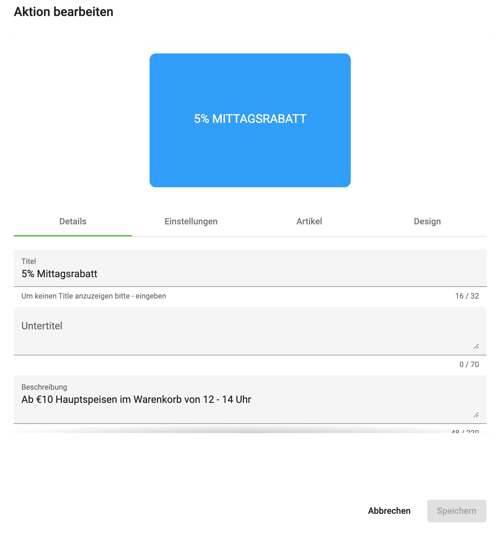
In the first Details tab you can make the following settings.
Title – in this field you can define a title that is shown to the app user; if you don't want a title, write a - in the field.
Subtitle – in this field you can add a short text, which is shown centred under the title.
Description – in this field you can define a description for the promotion card; this is seen by the user when they tap the card in the app, which then flips and shows the text.
Example for the labelling.
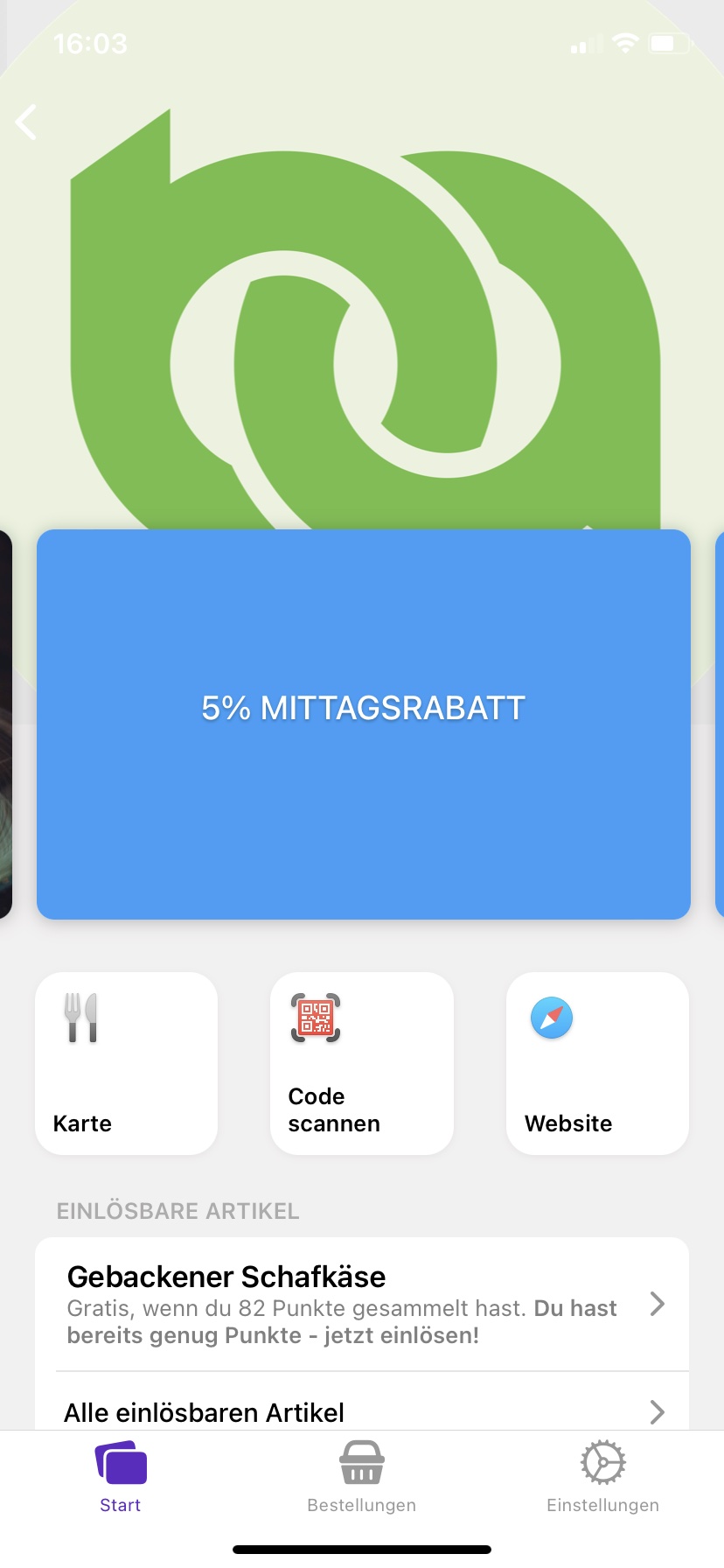
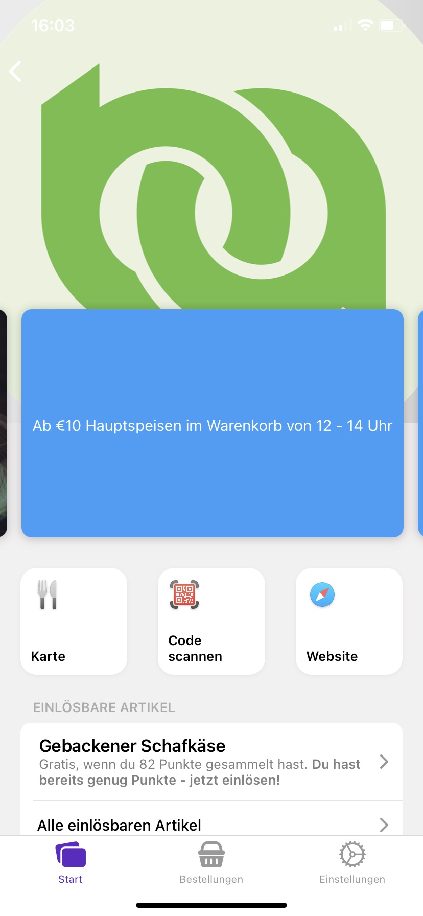
In addition to the title and descriptions, further settings can be added, as visible in the image below.
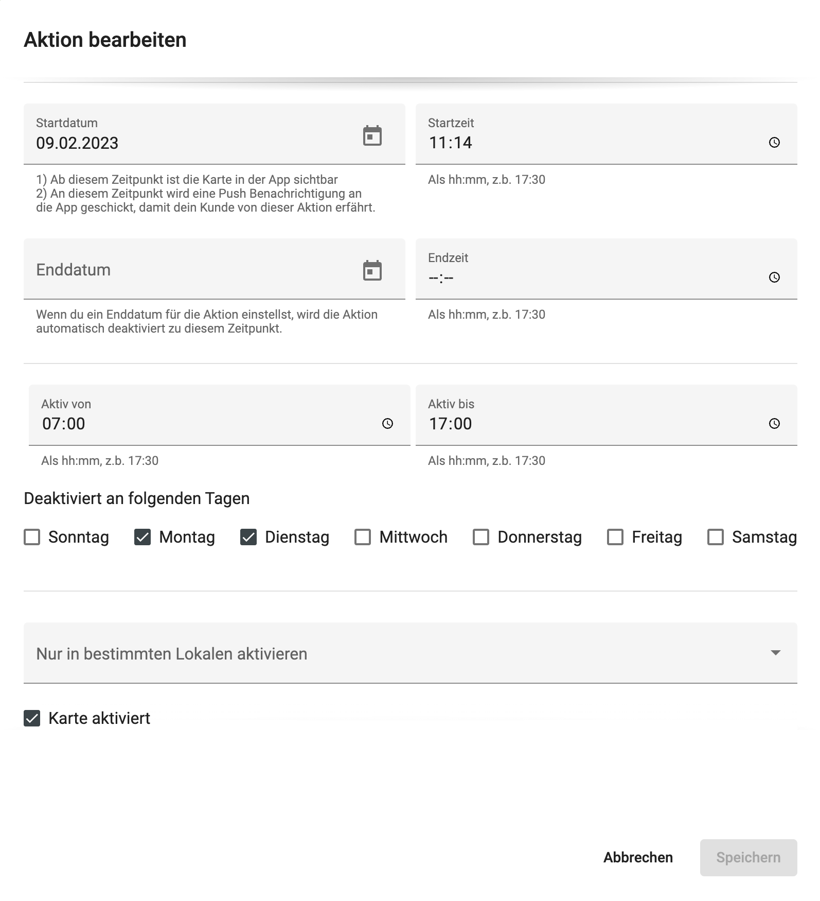
Start date and start time – with these two fields you specify from when a promotion card is valid.
End date and end time – with these two fields you specify until when a promotion card is valid.
Active from – Active until – with these two fields you can further restrict the time during which a promotion card can be used. For example, you can define a lunch promotion card that can be redeemed from 11:00 to 13:00.
Deactivated on the following days – with this field you can deactivate the card on certain weekdays; as visible in the image above, the card cannot be used on Monday and Tuesday.
Activate only in specific venues – in our system it is possible for customer loyalty cards to be used across multiple venues simultaneously. If this is not desired, you can restrict the card to specific venues.
Card activated – with this action you can deactivate the card at short notice.
The fields described are cumulative, meaning that all fields are evaluated together for the card to be displayed in the app. Example: the date must be after the start date, before the end date, must satisfy the time restriction of the Active from / Active until fields, and must not fall on a deactivated weekday.
Design Settings
With these settings you can design the look of this card. The image below shows an example of a designed Info promotion card.
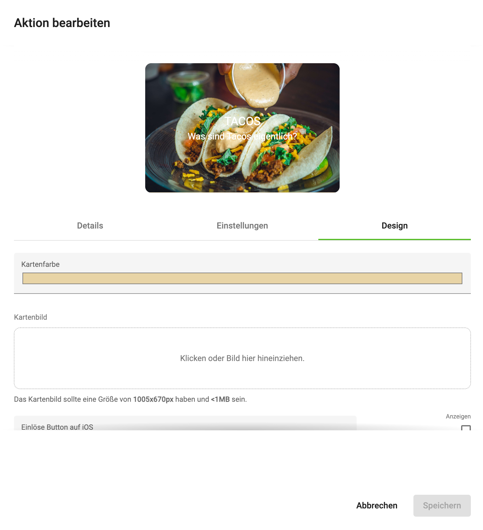
Card colour – this field controls the colour of the back of the promotion card.
Card image – this field can be used to use an image for the front view of the card; it is shown as in the image above.
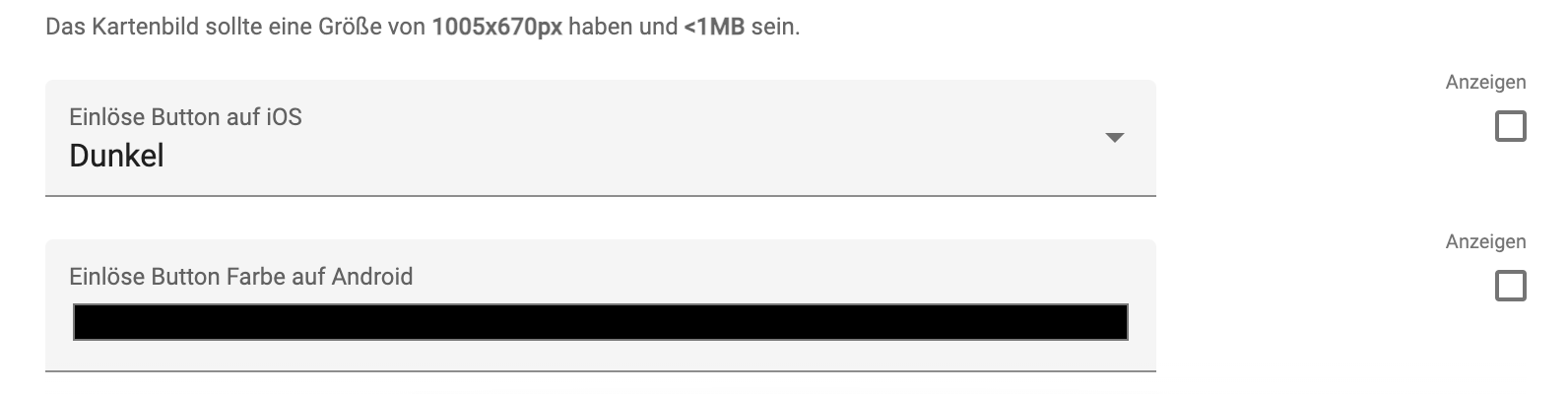
Redeem button – with this field you can change the look of the redeem button on iOS (iPhone).
Redeem button colour – with this field you can control the look of the redeem button on Android.
Info Promotion Card Settings
Here you can store an information link for the promotion card; it is then shown in the app. This can refer to a website you use to give the app user more information.
Top Up to Another Card Settings
Here you can top up a specific value to a loyalty pass. In the following example, 20 points are topped up to the loyalty pass Coffee card. For more information about collector cards, go to the Loyalty Pass section.
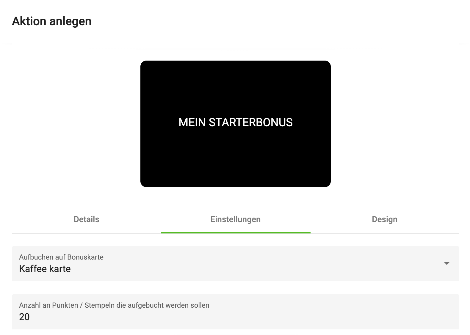
Top up to bonus card – here all loyalty passes you have created are shown; these can be used as the target of the action. Therefore, before you create a promotion card with top-up functionality, the loyalty pass must already be created.
Number of points / stamps to top up – with this field you can specify the number of points or stamps to be transferred.
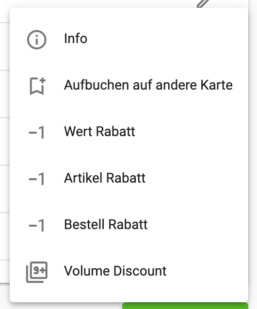
Value Discount Settings
With this promotion card the customer can redeem a value defined by you. This can be an absolute value or a percentage. This value is deducted from the entire order. The amount intended for redemption must be defined when creating the card; it cannot be changed afterwards.
If you want a different amount, create the card a second time and control the start and end dates of the two cards via the Details tab.
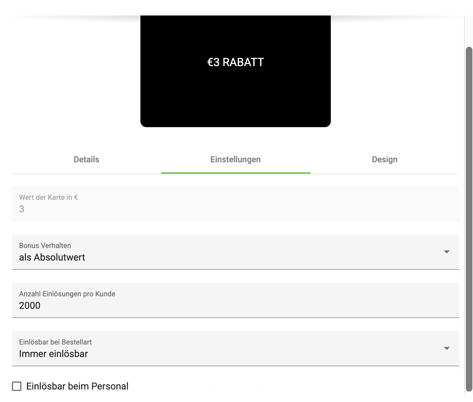
Card value – this field determines the value of the promotion card; it can only be entered while the card is being created.
Bonus behaviour – this field determines how the value of the promotion card is calculated in an order. The following options exist:
-
as absolute value – Example: €20 order – €3 discount, €17 are posted.
-
as percentage – Example: €100 order – 3% discount, €97 are posted.
Number of redemptions per customer – determines how often a customer may redeem this bonus.
Redeemable for order type – determines for which orders the customer may redeem this bonus.
Redeemable at staff – this card can also be redeemed directly at the Sales Point. Procedure:
-
The app user clicks on the promotion card in the app and then on Redeem.
-
A QR code is generated.
-
This is scanned by the Sales Point; the Sales Point credits the bonus to the customer's invoice.
-
The Sales Point reports to our server that the promotion card was redeemed.
The following Sales Points support this mode:
-
x3000
-
dieKasse
Article Discount
With this promotion card a discount can be granted on articles selected by the customer. This would be, for example, a promotion such as "Today, pizza salami at half price".
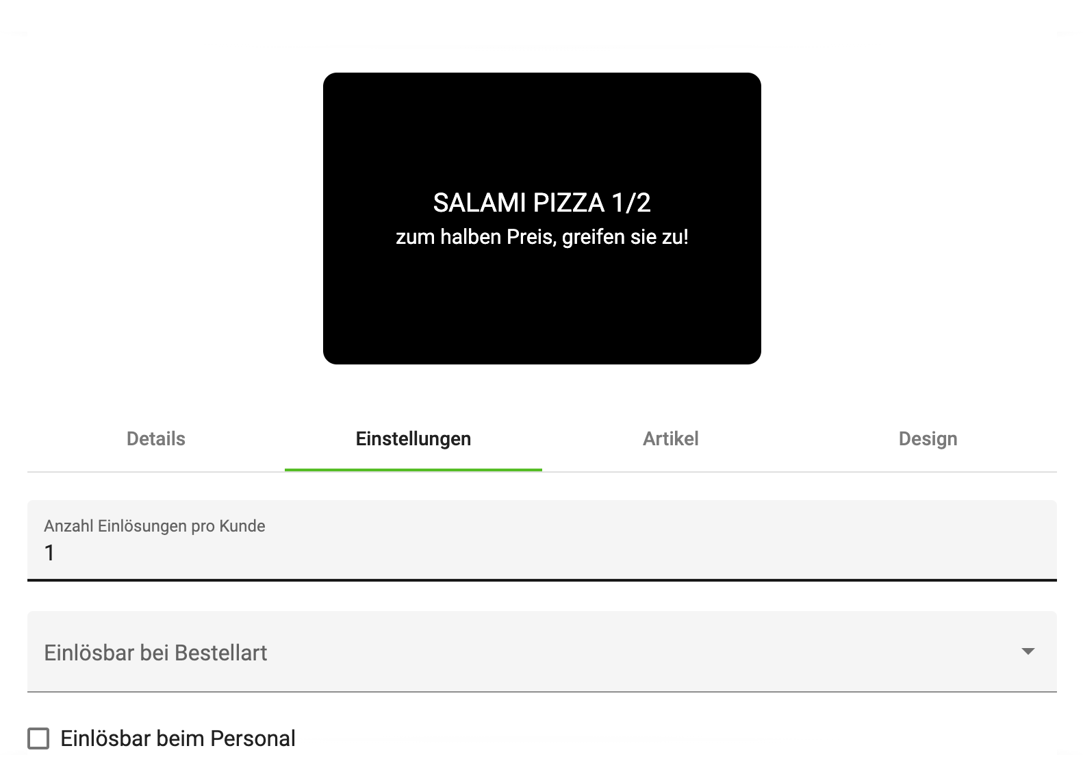
Number of redemptions per customer – determines how often an app user may redeem this article discount.
Redeemable for order type – determines for which orders the app user may redeem this bonus.
Redeemable at staff – this card can also be redeemed directly at the Sales Point. Procedure:
-
The app user clicks on the promotion card in the app and then on Redeem.
-
A QR code is generated.
-
This is scanned by the Sales Point; the Sales Point credits the bonus to the customer's invoice.
-
The Sales Point reports to our server that the promotion card was redeemed.
The following Sales Points support this mode:
-
x3000
-
dieKasse
How you select articles is described under the Order Discount section.
Order Discount
With this promotion card the customer can grant a discount on certain articles. It can be redeemed during an order in our ordering system. E.g. during lunch hours all pizzas have a 20% discount.
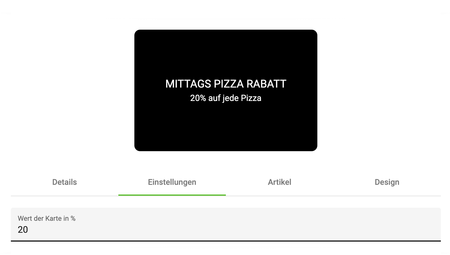
Card value in % – here the customer can specify how much discount is granted on the articles.
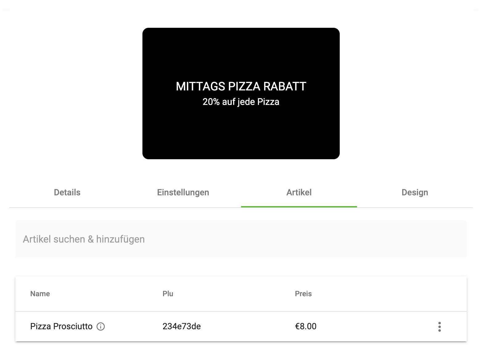
In the Article selection tab you can select the articles affected by this promotion.
-
Click into the field Search & add article
-
Enter the PLU or the name of the article
-
A drop-down menu appears; select the desired article
-
The article then appears in the article list under the search field
Volume Discount
With this promotion card you can map volume promotions, for example if you want to sell 3 pizzas for the price of 2. The image below shows the rule needed to model our example.
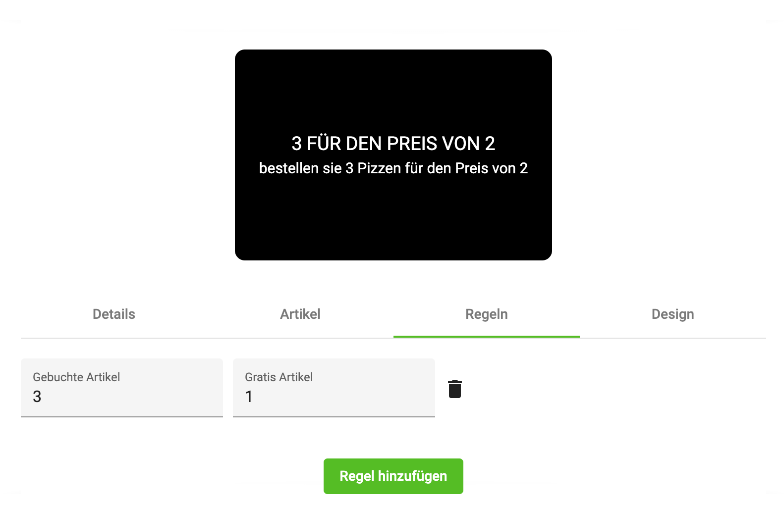
Booked articles – the number of articles, defined by you in the Articles tab, that must be present in an order. So that the Free articles field can be applied.
Free articles – the number of articles credited to the customer free of charge.
Trash icon – with this you can delete the rule again.
You can also combine multiple rules by simply creating multiple. You could, for example, also set up a rule that says "from 5 pizzas, 2 pizzas are free". Since rules can also contradict each other, we recommend that you test such a promotion card before going live with it.
Threshold Discount
With this promotion card you allow the customer to receive a discount from a certain order value. A threshold discount promotion card consists, similar to the top-up promotion card, of 2 promotion cards.
-
The threshold promotion card itself
-
The discount card – this can be a value, article or order discount.
Threshold – with this you specify from when the discount is granted. E.g. from €100 orders you grant the customer a €5 discount.
Discount – with this field you specify which discount the customer receives. This card must be created before the threshold discount card is created.
4. Customer Cards
In this Manager menu item you can track how many collector cards are active or have been redeemed. In this view you can filter by the following points.
-
Card status – redeemed, active
-
By card – select one of your collector cards
-
External ID – if you use our Voucher/Coupon system, you can search for a specific card via the NFC code.
-
E-mail – you can search for vouchers here using the customer's e-mail.
The customer cards can also be linked with real plastic customer cards. A customer card must be created in the bessa system. Please contact a bessa employee for this; they will set up a customer card for you.
In this Manager menu item you have the option to track the status and redemption of collector cards. You can filter the view by various criteria:
-
Card status: redeemed: shows the collector cards that have already been redeemed. Active: shows still-active, unredeemed collector cards.
-
Filter by card: you can select a specific collector card to get detailed information about it.
-
External ID: if you use our Voucher/Coupon system and have an NFC code, you can search for a specific card by entering the external ID.
-
E-mail: if you use our Voucher/Coupon system and the customer purchased a voucher code via the web shop or the app, you can search using the customer's e-mail.
Table fields:
-
Modified – when the card was last modified.
-
Created – when this card was created.
-
Customer – name of the customer.
-
Card – name of the card.
-
Collected – number of collected points, stamps or remaining voucher amount.
-
External ID – the external ID/voucher code of the voucher.
-
Redeemed – clicking the Info button gives you an overview of the transaction history of the selected card.
The customer cards can also be linked with real plastic customer cards. To create a customer card in the bessa system, please contact a bessa employee. They will set up a customer card for you and provide you with further information.
Please note that the actual user interface and features in your bessa system may vary. Adapt the information accordingly to your specific circumstances.
Lifecycle of a Customer Card
-
The card is given to the customer at the Sales Point. The customer card has a unique card number with which bessa binds the customer to this card and the customer can then collect bonuses.
-
The customer buys something and, when paying at the Sales Point, gives the employee their customer card. It is scanned and the information is sent to the bessa server. bessa then credits the customer with points or stamps, depending on the configured cards.
-
If the customer has collected enough points, they can redeem their bonuses at the Sales Point using the card. The card is scanned, the Sales Point recognises that there is a redeemable bonus.
-
The bonus is redeemed and the customer card is debited by this bonus.
Bessa can then create reports based on the customer card about the purchasing behaviour of various customers.
For more information about the Sales Point interface, please read this documentation.
Print Voucher / Print Invoice
You can display the transaction history via the Info button. In this menu you can then print the voucher or invoice. As an example, a screenshot with this functionality.
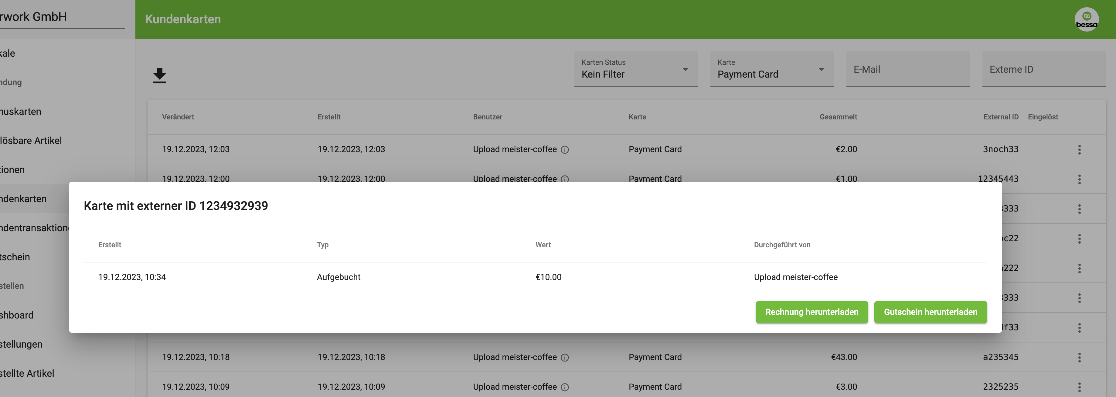
Book / Cancel Voucher
You can cancel a voucher or book a new amount. Select a voucher, then click the 3-dot icon, then the Edit button.
In the dialog that appears, you can cancel or book the voucher.
5. Customer Transactions
In this Manager menu item you can track how many points or vouchers are active or have been redeemed, booked or cancelled. In this view you can filter by the following points.
-
Transaction type – redeemed, topped up, cancelled
-
By card – select one of your collector cards
-
Venue – select in which venue a transaction took place.
-
External ID – if you use our Voucher/Coupon System, you can search for a specific card via the NFC code.
-
Period – please enter a period in which you want to see the transactions.
In this Manager menu item you have the option to track the status and redemption of collector cards. You can filter the view by various criteria:
-
Transaction type: redeemed: shows transactions in which points or money were redeemed. Topped up: shows transactions in which points or money were topped up. Cancelled: shows transactions in which points or money were cancelled.
-
Filter by card: you can select a specific collector card / voucher card to get detailed information about it.
-
Filter by venue: you can view transactions of only one venue.
-
External ID: if you use our Voucher/Coupon system and have an NFC code, you can search for a specific card by entering the external ID.
-
Time filter
Table fields:
-
Modified – when the card was last modified.
-
External ID – the external ID with which the transaction was created.
-
Venue – name of the venue where the transaction took place.
-
Customer – name of the customer.
-
Card – name of the card.
-
Value – value of the transaction.
-
Type – the type of the transaction.
Please note that the actual user interface and features in your bessa system may vary. Adapt the information accordingly to your specific circumstances.
Export / Download
You can also use this menu item to export transactions and use them for internal analyses. To do so, click the Download icon. You can then download your filtered table selection.
-
Simple version – an Excel document with the data
-
Expert version – a CSV file with the data
6. Voucher
In this Manager menu item you can specify how the bessa system should behave when vouchers are purchased. Vouchers can be purchased in various places:
-
In the whitelabel app: users can buy a voucher directly in the app.
-
On the web: users can also buy a voucher via the web interface.
-
At the Sales Point: users can also buy a voucher directly at the Sales Point in the restaurant.
Further settings and options in this menu item are:
-
Activate vouchers in the app: enabling this switch activates the interface for voucher purchase in your whitelabel app.
-
Email notification: you can specify an email address to which notifications about user behaviour during voucher purchase are sent.
-
Sales Point orders: when this option is enabled, you are notified when your Sales Point sells a voucher. Note that your Sales Point must support this feature (e.g. x3000, dieKasse). This setting works in combination with the email field.
-
Customer orders: when a customer buys a voucher in the app, you receive a notification by email. This setting also works in combination with the email field.
-
Voucher background: you can set an image used in the app or on the web interface for the voucher purchase. This allows you to customise the look of the voucher.
Generate Voucher
With this form you can quickly and easily create a voucher. The voucher is then sent to the customer by email. The "Voucher value" field allows you to control the value of the voucher. Furthermore, you can decide via this tool how the customer receives the voucher and how it should appear in accounting.
Voucher Template
With this form you can easily upload and configure voucher templates.
Please note that the exact appearance and features of the purchase interfaces in your whitelabel app and the web shop depend on your individual settings and designs. Adapt the information accordingly to your specific circumstances.
Here you see how to set up the voucher module.
Online Ordering
This section contains all menu items needed to configure the bessa ordering modules.
1. Dashboard
In the Dashboard menu item, you can see how many bessa orders have been processed by the system. Various filters are available with which you can restrict the number of orders made.
-
Select venue: here you can select the desired venue to display a summary of orders for it. This field is only displayed if you have more than one venue in your account.
-
Preset: in this field you can select predefined time filters to see how many orders were processed this week, last week or this month.
-
Customise start, customise end: with these two fields you can set a custom time range and display the orders in this period.
After you have set a filter, various tiles are shown as a result. These tiles are divided into different sections:
-
Successful orders: count: the total number of successfully processed orders. Revenue: the total revenue of the orders. Tip: the total tip given by customers. Payment methods: a breakdown of the various payment methods used.
-
Missed orders: count: the number of orders that were not processed properly. Revenue: the revenue of missed orders. Tip: the tip of missed orders.
-
Voucher analysis: with this feature, you can download a CSV file listing the vouchers used for the period you set.
Please note that the dashboard is adapted depending on your individual settings and the data available in your account. Adapt the information accordingly to your specific circumstances.
2. Orders
In the "Orders" menu item, you can display detailed information about orders processed via bessa. Various filters are available to restrict the orders displayed.
General filters:
-
Select venue: here you can select the desired venue to display a summary of orders for it. This field is only displayed if you have more than one venue in your account.
-
Preset: in this field you can select predefined time filters to see how many orders were processed this week, last week or this month.
-
Customise start, customise end: with these two fields you can set a custom time range and display the orders in this period.
-
Download arrow: with this you can export your filtered analysis as CSV.
Special filters:
-
Select order types: here you can select the desired order types to display only orders of those types.
-
Select order status: here you can select the desired order statuses to display only orders with those statuses. Examples of order statuses are: "Waiting for payment", "Payment cancelled", "Payment failed", "Sending to Connector", "Received at bessa Connector", "Expired", "Rejected", "Accepted", "Cancelled" and "Done".
-
Select paid: here you can filter your orders by payment method (PayPal, cash, etc.).
-
Select identity: here you can filter your orders by identity (guest, etc.). Note that these filters are only active when explicitly requested by the customer, e.g. in the bessa kiosk module.
With these filter options you can adjust orders to your individual needs and requirements and retrieve specific information.
Table fields:
-
Date – when the order was created
-
Code – pickup code, table, depending on the order type
-
Status – order status of the order
-
Total – order value
-
Paid with – payment method
-
Order type
-
Info button – with these you can get detailed information about the order.
3. Ordered Articles
In the "Ordered Articles" menu item, you can display detailed information about the articles that were ordered. Various filters are available to restrict the articles displayed.
General filters:
-
Select venue: here you can select the desired venue to display a summary of orders for it. This field is only displayed if you have more than one venue in your account.
-
Preset: in this field you can select predefined time filters to see how many orders were processed this week, last week or this month.
-
Customise start, customise end: with these two fields you can set a custom time range and display the orders in this period.
-
Download arrow: with this you can export your filtered analysis as CSV.
-
Select identity: here you can filter your articles by identity (guest, etc.). Note that these filters are only active when explicitly requested by the customer, e.g. in the bessa kiosk module.
With these filter options you can adjust orders to your individual needs and requirements and retrieve specific information.
Table fields:
-
PLU – Sales Point article number
-
Name – name of the article
-
Count – how often the article was sold in the filtered period.
4. Menus
In the "Menus" menu item, you can display detailed information about the menu cards. Menus can also be created here.
A menu is the entry point for the user when they use the web app or the whitelabel app. The customer chooses their order mode and then sees the menu defined for it in this menu item.
A menu consists of menu categories, which in turn consist of articles from which the customer builds their order.
General filters:
-
Select venue: here you can select the desired venue to display a summary of orders for it. This field is only displayed if you have more than one venue in your account.
-
Search by name: here you can filter the menus by name.
Table fields:
-
Name – name of the menu
-
Type – order type; you can create a menu for each order type.
-
Menu categories – the number of categories in this menu.
4.1 New Menu
When you click the "+ New Menu" button, a dialog opens in which you can create a new menu.
Details:
In this tab you must give the menu a name and select an order type.
Menu categories:
In this tab you can add categories to the menu via the search field. These categories are handled in the "Menu Categories" menu item. You can adjust the order of the categories using the sort icon.
4.2 Notes
Menus can be created by you. With some Sales Point integrations, however, the menus can only be created directly on the Sales Point and are then loaded via a data interface.
-
x3000 – the menu is created on the Sales Point. Link to documentation.
5. Menu Categories
In the "Menu Categories" menu item, detailed information about the menu categories is displayed. Menu categories can also be created here.
General filters:
-
Select venue: here you can select the desired venue to display a summary of orders for it. This field is only displayed if you have more than one venue in your account.
-
Search by name: here you can filter the categories by name.
Table fields:
-
Name – name of the category
-
Article count – number of articles in this category
-
Subcategories – the number of subcategories in this menu.
5.1 New Category
When you click the "+ New Category" button, a dialog opens in which you can create a new category. This button is only displayed if your Sales Point integration does not support categories.
Details:
In this tab you can make the basic settings of the category.
-
Card image – optional; you can store an image for the category, which is then shown in the app or web shop.
-
Category name – mandatory; every category must have a name, freely choosable.
-
Description – optional; this is shown in the app or on the web.
-
Time restriction – here you can restrict the category, e.g. a lunch category from start time to end time.
-
Day restriction – menu categories can also be restricted by day, e.g. only on Wednesdays there is a special menu.
-
Standard – this green button allows the category to be translated into different languages. Clicking this button opens a language selection. When you select a language, your new translation is stored in the "Category name" and "Description" fields.
Articles:
In this tab you can add articles to the category via the search field. These articles are handled in the "Articles" menu item. You can adjust the order of the articles using the sort icon.
Subcategories:
In this tab you can add categories to the category via the search field. You can adjust the order of the categories using the sort icon.
6. Articles
In the "Articles" menu item, detailed information about the articles is displayed. Articles can also be created here. In general, articles are always imported from the Sales Point. You can, however, still create articles here to cover special cases.
General filters:
-
Select venue: here you can select the desired venue to display a summary of orders for it. This field is only displayed if you have more than one venue in your account.
-
Search by name: here you can filter the articles by name.
Table fields:
-
Name – name of the article
-
PLU – the article PLU of the article in the Sales Point
-
Price – the gross price of the article
-
Available count – in bessa it is possible to limit the article so that only 10 pieces can be sold per day. This field is empty if there is no configuration for this article.
-
Settings button – 3 vertical dots: edit article – opens a dialog to edit the article (described under "New Article"); delete article; copy article – this article is copied and added to the table.
6.1 New Article
When you click the "+ Add Article" button, a dialog opens in which you can create a new article. The same dialog is used to edit articles. This button is only displayed if your Sales Point integration does not support categories.
Details:
In this tab you can make the basic settings of the article.
-
Article image – optional; you can store an image for the article, which is then shown in the app or web shop.
-
Price – here you can give the article a price. We also support pricing levels (see here).
-
Name in the app – optional; you can give the article a name. We recommend giving every article a name.
-
Description – optional; this is shown in the app or on the web.
-
Allergens – optional; you can give the article an allergens description. Allergens list
-
Standard – this green button allows the article to be translated into different languages. Clicking this button opens a language selection. When you select a language, your new translation is stored in the "Name in the app", "Description" and "Allergens" fields.
Settings:
In this tab you can make further specific settings for this article. The following settings are available.
-
Limited count – when this option is enabled, you can enter how often this article can be ordered. This option enables the Count field, in which you can enter the desired count. For daily articles, this field must be set to the desired count every day. As soon as 0 is reached, the article is deactivated until you increase the count again here.
-
Count – the number of articles available, if "Limited count" is enabled.
-
Minimum order quantity – the customer is forced in the app and web shop to take a minimum number of this article. This setting is needed, for example, for multi-person menus where you need at least 2 portions.
-
Dispenser PLU – if the dispenser module is enabled, the dispenser PLU can be entered here.
-
Activated – the article is active; if deactivated, it is no longer shown in the app or web shop.
Article side dishes:
In this tab you can add article side dishes to the article via the search field. These are handled in the "Article side dishes" menu item. You can adjust the order of the article side dishes using the sort icon.
7. Article Side Dishes
In the "Article Side Dishes" menu item, detailed information about article side dishes is displayed. Articles can also be created here. In general, article side dishes are always imported from the Sales Point. You can, however, still create article side dishes here to cover special cases.
General filters:
-
Select venue: here you can select the desired venue to display a summary of orders for it. This field is only displayed if you have more than one venue in your account.
-
Search by name: here you can filter the article side dishes by name.
Table fields:
-
Name – name of the side dish; on the second line, articles where this side dish is used.
-
Contains – the number of side dishes (which are again articles) used in this side dish. Example: Steak side dish – has 3 articles that can be booked with the dish Steak.
-
Modified – the number of articles where this side dish is used.
-
Automatic – this side dish is automatically added to the article when it is ordered. Example: packaging is automatically booked and charged.
-
Disabled – this side dish has been disabled.
-
Settings button – 3 vertical dots: edit article side dish – opens a dialog to edit the side dish (described under "New article side dish"); delete article side dish; copy article side dish – this side dish is copied and added to the table.
6.1 New Article Side Dish
When you click the "+ New article side dish" button, a dialog opens in which you can create a new side dish. The same dialog is used to edit the side dish. This button is only displayed if your Sales Point integration does not support categories.
Details:
In this tab you can make the basic settings of the side dish.
-
Description – this is shown in the app or on the web.
-
Minimum selection – the minimum selection that the user must make.
-
Maximum selection – the maximum selection that a customer can make.
-
Add automatically – defines whether the articles in the group should be added automatically; the user in the app does not see this group. Only works in combination with a restriction by order type.
-
Restrict to order type – with this you can restrict the side dish to an order type. Packaging is only used for delivery orders.
-
Activated – the side dish is active; if deactivated, it is no longer shown in the app or web shop.
-
Standard – this green button allows the article to be translated into different languages. Clicking this button opens a language selection. When you select a language, your new translation is stored in the "Name in the app", "Description" and "Allergens" fields.
Examples:
A minimum selection of 1 and a maximum selection of 1 forces the user to choose a side dish. This is needed, for example, for selecting a flavour for drinks.
A minimum selection of 0 and a maximum selection of 1–n are optional side dishes that the customer doesn't have to use but can.
Contains articles
In this tab you can define which articles are used as side dishes.
You can use the "Search & add article" field to find and add articles. You can adjust the order of the articles using the sort icon.
Preselected article – with this field you can preselect a side dish. We recommend that all customers preselect a side dish.
Modifies articles
In this tab you can define which articles need this side dish selection.
In this tab you can add article side dishes to the article via the search field. These are handled in the "Article side dishes" menu item. You can adjust the order of the article side dishes using the sort icon.
7. Order Settings
In the "Order Settings" menu item, detailed information about order settings is displayed. Here you can configure all order types and use them for your purposes. The order settings are divided into subgroups; we cover each point individually.
General filters:
-
Select venue: here you can select the desired venue to display a summary of orders for it. This field is only displayed if you have more than one venue in your account.
7.1. Table Codes
With this settings group you can generate QR codes needed for table orders, app downloads and web shop orders. Users can scan these codes and then perform the corresponding action.
When you click on this tile, a dialog opens with three tabs.
Tables
Here you can create QR codes for your table ordering module. For each table that has been synchronised from the Sales Point, a QR code is generated. This table is then stored in the orders at the Sales Point, so you can recognise at the Sales Point which table ordered.
On the left side are the fields with which you can influence the appearance of the QR code.
-
Image type: QR code or barcodes – you can change the appearance of the QR code with this.
-
QR code colour: the colour of the QR code.
-
QR code background colour: the background colour of the QR code.
-
Logo: you can upload a logo, which is then shown in the centre of the QR code.
-
Add table name: you can also place the table name on the QR code image.
-
Inactive tables: you can also create QR codes for inactive tables, which can possibly be used later.
-
QR code preview button: with this button you can generate a preview.
On the right side you can then download all QR codes with the respective buttons.
App:
Here you can create a QR code with which the whitelabel app can be downloaded.
On the left side are the fields with which you can influence the appearance of the QR code.
-
QR code colour: the colour of the QR code.
-
QR code background colour: the background colour of the QR code.
-
Logo: you can upload a logo, which is then shown in the centre of the QR code.
-
QR code preview button: with this button you can generate a preview.
Web Shop:
Here you can create a QR code with which the web shop can be downloaded.
On the left side are the fields with which you can influence the appearance of the QR code.
-
QR code colour: the colour of the QR code.
-
QR code background colour: the background colour of the QR code.
-
Logo: you can upload a logo, which is then shown in the centre of the QR code.
-
Custom URL: you can embed the web shop in your own homepage. Use this field to enter your URL so that the QR code points to it.
-
QR code for an order type: when this field is used, you can create a QR code that leads directly to the selected order type.
-
QR code preview button: with this button you can generate a preview.
7.2 Times
With this settings group you can configure order times for each individual order type.
When you click on this tile, a dialog opens with five tabs, where each tab represents one order type.
You see all weekdays and can enter the times for the respective day in the input fields. If no times are entered, this means that no orders are possible on this day.
The input format for the times is as follows: 00:00 – 23:59. If you want to be open all day, please enter 00:00 – 00:00.
The plus button generates another input field in which you can enter another time range. The red trash icon deletes the order time.
Please note that the venue's opening hours are not identical to the order times. We distinguish here, since many venues have different kitchen times compared to opening hours.
7.3 Sales Point Settings
With this settings group you can store the Sales Point data in bessa. This data is required to connect bessa to the Connector installed on the Sales Point.
Fields:
-
Cashbox ID of the Sales Point: this ID corresponds to the TSE ID in Germany or the fiscalisation ID in Austria. It is used to distinguish the various Sales Points.
-
Token: this field contains the API token with which the Connector can connect to bessa.
-
IP address: here the IP address of the computer on which the Sales Point interface runs is specified. This allows the Connector to find the corresponding computer.
-
Port: this value specifies the port on which the Sales Point interface runs.
-
Automatically to background: when all orders have been processed, the Connector minimises automatically into the background.
-
Automatically to foreground: when a new order is received in the Connector, the window is automatically brought to the foreground.
Status:
In this area you can check the connection status of the Connector.
-
Connector reported: here the date is shown when the Connector last reported to bessa.
-
Reporting: if the KPI app has been activated, you see here when the Sales Point last synchronised its data with bessa.
-
Ordering enabled: if the value is "true", this means that orders are possible and the Sales Point successfully connected to the Connector. If the value is "false", this means that the Sales Point is not establishing a connection to the Connector.
7.4 Order Settings
With this settings group you can store the order data in bessa. This data is needed to test the installed Connector.
Fields:
-
Select test article 1: here you can select an article that is sent in the test order to the Sales Point.
-
Select test article 2: here you can select an article that is sent in the test order to the Sales Point.
-
Bessa server: this server is used at the Sales Point to book the order to it; required for the Gastrotouch Sales Point.
-
Create phantom orders: defines whether phantom orders should be created in bessa for orders that originate at the Sales Point. This setting is only used for X3000 or dieKasse.
7.5 Order Type Settings
With this settings group you can configure each individual order type. This configuration is required to enable control of the whitelabel app, the dispenser, kiosk, tablet and web shop modules.
When you click on this tile, you first see a field in which you can select one of the available order types. The tabs in the dialog change accordingly depending on the order type selected. When the dialog is opened for the first time, no order type settings are present yet. By clicking on the respective order type, you can create the configuration for it.
Available order types
-
On premise: has 2 tabs for the configuration: basic configuration, order slot settings
-
Pickup: basic configuration, order slot settings, pre-order settings
-
Delivery: basic configuration, order slot settings, pre-order settings
-
Self Service: basic configuration, order slot settings
-
Dispenser: basic configuration, order slot settings
Basic configuration
In this tab the standard configurations needed to configure an order type are gathered.
The various fields are:
-
Activated: defines whether this order type is active. If not enabled, it is not shown in the web app or whitelabel app.
-
Payment methods: the payment methods available for this order type.
-
Automatic acceptance: orders are automatically accepted by the Connector. For deliveries, a delivery time of 45 minutes is used.
-
Play sound for automatic acceptance: defines whether a sound is played on automatic acceptance. This means that every time an order is accepted by the Connector, a sound is played.
-
Print invoice: the invoice is printed immediately and the table is closed. This setting refers to the Sales Point itself.
-
Close cash payment: cash payments also close the table immediately. This setting refers to the Sales Point itself.
-
Allow time change: the customer chooses a fixed time when ordering, e.g. 12:00. With this setting, the order time can be changed in 10-minute steps when accepting the order, e.g. to 12:20. This option is only enabled for deliveries and pickups.
-
Fixed acceptance times: predefined times that are available for selection in the Connector. You can choose here which times to display. This option is only enabled for deliveries and pickups.
-
Allow comments: the user is allowed to write comments for the individual articles being ordered, e.g. "extra spicy".
-
Number range start: the customer can use their own order number range to better manage orders. It starts at any number and is then incremented. Deliveries from 20000. Pickups from 30000.
-
Enable tip: the whitelabel app and web shop offer a tip field where the user can give a tip for the order.
-
Tip mode: describes how the tip is calculated, either as a percentage or in 50-cent steps.
-
Minimum order value: the user can only order if the order value exceeds a certain amount. This option is only enabled for deliveries and pickups.
-
Pricing levels: if the Sales Point supports pricing levels and these have been synchronised with bessa, you can select a pricing level here. If no specific pricing level is selected, the standard price is used.
Order slot settings
In the "Order slot settings" tab the settings for order slots are gathered. These settings serve to protect the restaurant from overload. An order slot has a certain size, e.g. 15 minutes, and during this time window a certain number of dishes can be ordered. If more dishes are ordered than allowed in the slot, the user is informed that they have to choose the next order slot. This ensures that not too many dishes can be ordered at once.
The various fields are:
-
Number of orders per slot: the maximum number of orders possible in a slot. When the slot is full, the next free slot is automatically suggested in the app.
-
Slot size: the duration of the slot in minutes. This can be freely chosen by the customer.
-
Time addition for the current time: this setting indicates how much time should be added to the current point in time to find the first order slot. For example, when it is 11:10 and you set a value of 20, the earliest available slot selection is > 11:30.
Pre-order settings
In the "Pre-order settings" tab you can make settings for pre-orders. This feature allows the restaurant to accept orders that are to be processed at a later time. This tab is only visible for pickup and delivery orders.
The various fields are:
-
Activated: with this setting you can specify whether this feature is enabled. If it is disabled, no pre-orders can be made in the whitelabel app or web shop.
-
Time addition for first order slot: this setting indicates how many minutes should be added to the first time point to calculate the first order slot. Suppose order times start at 11:00 and you set 20 minutes; then the first order slot is available from 11:20. This means the customer can order from 11:00, but their earliest time option is 11:20.
-
Pre-order threshold in minutes: this setting determines how long an order is considered a pre-order before it is converted to a regular order. The default is 60 minutes before the pickup or delivery time. A value less than 60 minutes is not allowed.
-
Pre-order period: here you can specify how many days in advance pre-orders are possible. The minimum value is 1 day and the maximum value is 7 days.
7.6 Delivery Areas
With this settings group you can configure the delivery areas and delivery fees for the "Delivery" order type. To define a new delivery area, click the "Add delivery area" button. A new delivery area is then created in the delivery area table, which is empty at the start. Then click the delivery area to open a dialog in which you can configure it in more detail.
The various fields are:
-
Minimum order value: this is the minimum amount that the customer must order via the app or web shop to receive a delivery.
-
Delivery fee: this is the fee the user must pay when an order is placed.
-
Delivery fee limit: from this amount, no delivery fee is charged anymore. The default value is 0, meaning this setting is ignored.
-
Query type: by postal code: deliveries are restricted to the postal code entries defined by the customer. By postal code & region: deliveries are restricted to the postal code entries defined by the customer. The customer must additionally specify the region. By radius around the venue: the customer defines a radius around the venue as the centre, within which the venue delivers.
-
Postal code field: this field becomes visible when the query type "By postal code" is selected. Here you can enter multiple postal codes.
-
Postal code field and region field: when a postal code has multiple regions, you must define a delivery area for each region and enter both the postal code and the region.
-
Delivery radius field: this field becomes visible when the query type "By radius around the venue" is selected. Here you can enter the radius in metres.
7.7 Payment Providers
With this settings group you can add payment providers used for online payments in the whitelabel app and the web shop.
When you click on the corresponding tile, a dialog opens in which you can add a payment provider. All existing payment providers are also already shown; from the green or red icon you can recognise whether your payment provider is also active. bessa currently supports the following payment providers:
-
Stripe
-
PayPal
-
PayJet
When you select a payment provider, the customer receives an email with instructions for setting up the payment provider. In this email you will find a guide on how to integrate the payment provider into the system.
Stripe
If you have followed the Stripe instructions, Stripe is automatically connected to bessa. Stripe offers the following payment options:
-
Credit card
-
Debit card
-
Apple Pay
-
Google Pay
PayPal
If you have followed the PayPal instructions, you must enter the Client ID and the Client Secret in this dialog. PayPal offers the following payment options:
-
Credit card
-
Debit card
PayJet
This integration must be specifically requested with the merchant. The PayJet data must then be entered in Manager. PayJet offers the following payment options:
-
Credit card
-
Debit card
-
Twint (only in Switzerland)
Hobex
This integration must be specifically requested with the merchant. The Hobex data must then be entered in Manager. Hobex offers the following payment options:
-
Credit card
-
Debit card
-
Apple Pay
-
Google Pay
Worldline
This integration must be specifically requested with the merchant. The Worldline data must then be entered in Manager. Worldline offers the following payment options:
-
Credit card
-
Debit card
-
Apple Pay
-
Google Pay
7.8 Closures / Holidays
With this settings group you can add company holidays, public holidays or other periods in which certain order modes or the entire business is not open. The customer then sees the duration of the closure in the whitelabel app and on the web shop.
When you click on the corresponding tile, a dialog opens in which you can add a period. Then click "+ Add period" in this dialog.
You must then enter a start and end time. You can also optionally specify a reason for the closure, or restrict the closure to a specific order type. Then save it. Closures that have expired are automatically hidden.
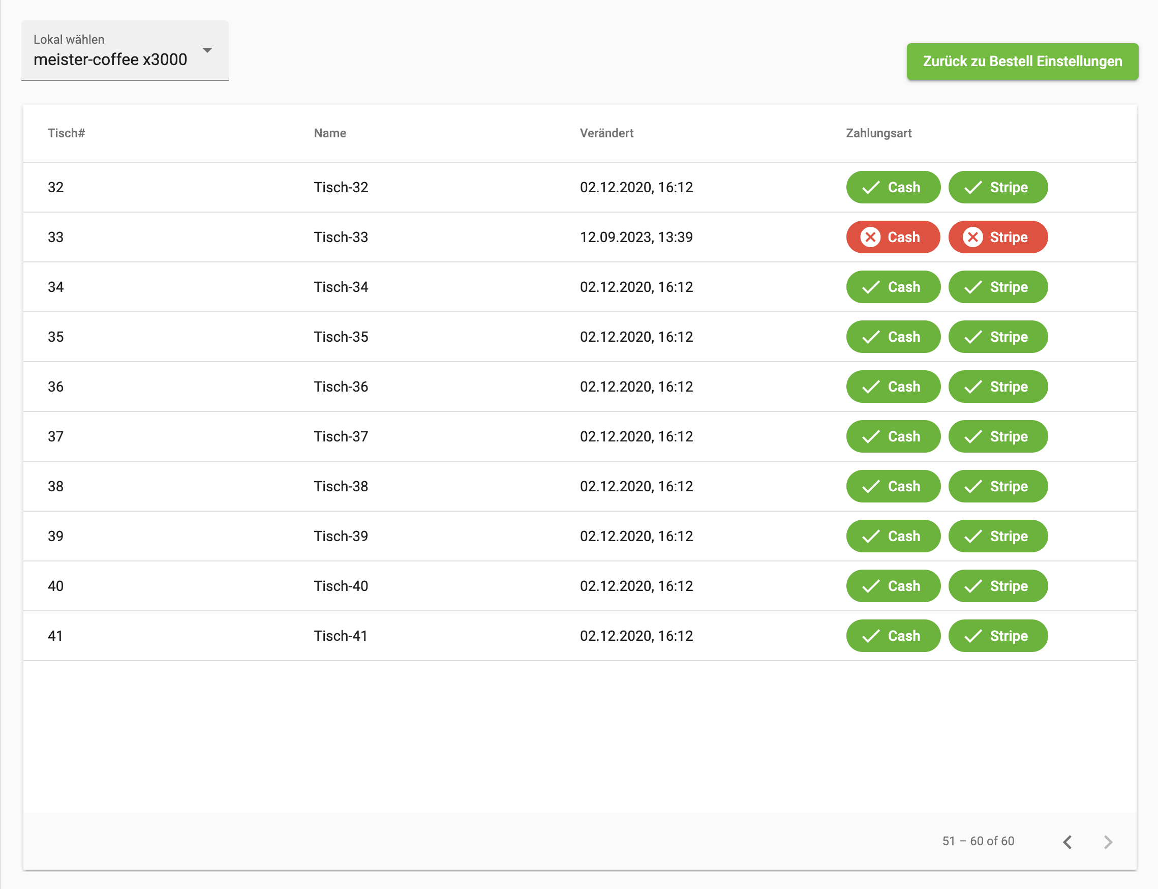
7.9 Table Settings
With this settings group you can switch the payment method on and off for individual tables. This feature can be used to disable certain payment methods for tables used in the Dine-In (on premise) order mode. So you can allow cash payments in the restaurant and disable them in the beer garden.
Signage Display
This section contains all menu items needed to configure a pickup screen or a daily menu screen.
-
Pickup screen: this is a display like the one used by McDonald's, for example. The order numbers or pickup codes are displayed, and once the customer has picked up their product, they disappear again.
-
Daily menu screen: there is the option to display the daily menu on an extra screen.
To configure these two features, the following two menu items are available in bessa Manager.
1. Daily Menu
In the "Daily Menu" menu item, detailed information about the daily menu is displayed. The daily menu entries can also be edited and created here.
General filters:
-
Select venue: here you can select the desired venue to display a summary of orders for it. This field is only displayed if you have more than one venue in your account.
-
Preset: in this field you can select predefined time filters to see how many orders were processed this week, last week or this month.
-
Customise start, customise end: with these two fields you can set a custom time range and display the orders in this period.
Table fields:
-
Date – when the menu was last modified.
-
Settings button – 3 vertical dots: edit daily menu – opens a dialog to edit the daily menu (described under "Create / edit daily menu"); delete daily menu; copy daily menu – this daily menu is copied and added to the table.
At the end there is also a "+ Add daily menu" button with which you can create a daily menu.
1.1 Create / Edit Daily Menu
When you click the "+ Add daily menu" button, a new dialog opens in which you can create a new daily menu.
Date: in this field you specify the date for which the following menu entries apply. With the "Add another menu" button, you can create another menu entry.
A menu entry consists of the following fields:
-
Menu image: this image is shown for the menu.
-
Name: the name of the menu, shown in the menu.
-
Price: the price of the menu.
-
Description: a brief description for the menu entry.
-
Allergens: a list of the contained allergens.
With the "Add another menu" button, you can create more menu entries for the daily menu.
1.2 Integrate the Daily Menu into the Whitelabel App or the Web Shop
There is also the option to integrate the daily menu into the menu used in the whitelabel app or in the web shop. Read the following help article to make this possible.
2. Pickup Screen
In the "Pickup Screen" menu item, you have the option to change the design of your pickup screen. You can also change the texts of the pickup screen. Click on the respective tile to configure your pickup screen.
1.1 Design
When you click on this tile, a dialog opens in which you can design the pickup screen to your liking.
The design is divided into 4 tabs. The individual design elements are grouped here.
General
-
Display time span in minutes: here you can specify how long a pickup code remains visible on the screen.
-
Maximum number of notifications: here you can specify how many orders should be displayed simultaneously on the pickup screen.
-
Play sound for ready food/drinks: when a drink or food is marked as ready, a sound is played on the pickup screen to inform the user.
Navigation
In this tab you can adjust the appearance of the navigation bar at the top of the pickup screen.
-
Background colour: with this field you can change the background colour of the navigation bar.
-
Text colour: with this field you can change the colour of the text on the navigation bar.
-
Text: with this field you can change the font of the text on the navigation bar.
-
Weight: with this field you can adjust the font weight of the text.
In Preparation
In this part of the settings you can show orders in preparation. The other menu items, which control the design of the order tiles, also apply to these tiles.
-
Show "in preparation" orders: with this mode you can also display orders that are still in preparation, to show the user what is currently being prepared in the kitchen.
-
Max orders: here you can specify how many of these orders should be shown simultaneously.
-
Separator colour: to visually separate orders in preparation from finished orders, a separator is used. With this field you can adjust the colour of this separator.
The Title section, where the title of the order tile is adjusted.
-
Text: here you can optionally specify a text for the title of the order. If no text is inserted, it is hidden completely.
-
Text size: with this field you can adjust the font size of the text. This setting is only applied if the "Text" field has been set.
-
Text colour: with this field you can adjust the colour of the text. This setting is only applied if the "Text" field has been set.
-
Text type: with this field you can adjust the font of the text. This setting is only applied if the "Text" field has been set.
-
Alignment: with this field you can adjust the text alignment. This setting is only applied if the "Text" field has been set. Start: left-aligned; center: centred; end: right-aligned.
The List section, where you can configure the list width; this setting is active when "In Preparation" is enabled.
-
Width: the width of the list of "in preparation" orders, in percent.
-
Background colour: the colour of the background on which the order tiles are displayed.
-
Direction: the direction in which the tiles are displayed. Left to right, top to bottom.
-
Horizontal alignment: the horizontal alignment of the tiles on the pickup screen. Start, centre, end.
-
Vertical alignment: the vertical alignment of the tiles on the pickup screen. Left, middle, right.
The "Empty list message" section controls the message displayed when no order is currently active.
-
Text size: with this field you can adjust the font size of the text.
-
Text colour: with this field you can adjust the colour of the text.
-
Text type: with this field you can adjust the font of the text.
-
Weight: with this field you can adjust the weight of the text.
The "Notification" section controls the appearance of the tile itself.
-
Width: the width of the tile in pixels.
-
Side padding: the minimum spacing the text in the tile may have from the edge of the tiles.
-
Background colour: with this field you can change the background colour of the tile.
The "Pickup code" section controls the appearance of the pickup code text.
-
Text size: with this field you can adjust the font size of the text.
-
Text colour: with this field you can adjust the colour of the text.
-
Text type: with this field you can adjust the font of the text.
-
Weight: with this field you can adjust the weight of the text.
The "Pickup text" section controls the appearance of the pickup text.
-
Text size: with this field you can adjust the font size of the text.
-
Text colour: with this field you can adjust the colour of the text.
-
Text type: with this field you can adjust the font of the text.
-
Weight: with this field you can adjust the weight of the text.
Done
In this part of the settings you can change the design of the tiles for "Done" orders.
The Title section, where the title of the order tile is adjusted.
-
Text: here you can optionally specify a text for the title of the order. If no text is inserted, it is hidden completely.
-
Text size: with this field you can adjust the font size of the text. This setting is only applied if the "Text" field has been set.
-
Text colour: with this field you can adjust the colour of the text. This setting is only applied if the "Text" field has been set.
-
Text type: with this field you can adjust the font of the text. This setting is only applied if the "Text" field has been set.
-
Alignment: with this field you can adjust the text alignment. This setting is only applied if the "Text" field has been set. Start: left-aligned; center: centred; end: right-aligned.
The List section, where you can configure the list width; this setting controls the "Done" setting.
-
Width: the width of the list of "in preparation" orders, in percent.
-
Background colour: the colour of the background on which the order tiles are displayed.
-
Direction: the direction in which the tiles are displayed. Left to right, top to bottom.
-
Horizontal alignment: the horizontal alignment of the tiles on the pickup screen. Start, centre, end.
-
Vertical alignment: the vertical alignment of the tiles on the pickup screen. Left, middle, right.
The "Empty list message" section controls the message displayed when no order is currently active.
-
Text size: with this field you can adjust the font size of the text.
-
Text colour: with this field you can adjust the colour of the text.
-
Text type: with this field you can adjust the font of the text.
-
Weight: with this field you can adjust the weight of the text.
The "Notification" section controls the appearance of the tile itself.
-
Width: the width of the tile in pixels.
-
Side padding: the minimum spacing the text in the tile may have from the edge of the tiles.
-
Background colour: with this field you can change the background colour of the tile.
The "Pickup code" section controls the appearance of the pickup code text.
-
Text size: with this field you can adjust the font size of the text.
-
Text colour: with this field you can adjust the colour of the text.
-
Text type: with this field you can adjust the font of the text.
-
Weight: with this field you can adjust the weight of the text.
The "Pickup text" section controls the appearance of the pickup text.
-
Text size: with this field you can adjust the font size of the text.
-
Text colour: with this field you can adjust the colour of the text.
-
Text type: with this field you can adjust the font of the text.
-
Weight: with this field you can adjust the weight of the text.
Standard buttons; these are always visible regardless of the tab being shown.
-
Show preview: a preview of the pickup screen is shown.
-
Cancel: the changes are not saved and the dialog is closed.
-
Save: the changes are saved and the dialog is closed.
1.2 Texts
When you click on this tile, a dialog opens in which you can design the texts of the pickup screen to your liking. The following fields are available to change texts.
-
Navigation bar: the text shown in the navigation bar.
-
Orders in preparation: the title shown in the list for orders in preparation.
-
Done orders: the title shown in the list for finished orders.
-
Orders in preparation appear here: the text for an empty list for orders in preparation.
-
Done orders appear here: the text for an empty list for finished orders.
-
In preparation: the text on the tile when the order is in preparation.
-
Drinks are ready: the text on the tile when the order's drinks are ready.
-
Food is ready: the text on the tile when the order's food is ready.
Standard buttons
-
Show preview: a preview of the pickup screen is shown.
-
Cancel: the changes are not saved and the dialog is closed.
-
Save: the changes are saved and the dialog is closed.
Your Own App
In this section of Manager are all settings that can be used to communicate with the customers of the whitelabel app.
1. Notifications
In the "Notifications" menu item, detailed information about notifications (push notifications) is displayed. Notifications can also be created here.
When you open the "Notifications" menu item, you see a table listing your created notifications. The table contains the following fields:
-
Name: here you find the name of the notification.
-
Start date: this date indicates when the notification was sent.
-
Edit icon: when you click on this symbol, a dialog opens in which the customer can edit the notification.
To create a new notification, click the "+ New Notification" button. This opens a dialog in which you can enter the required information for the notification.
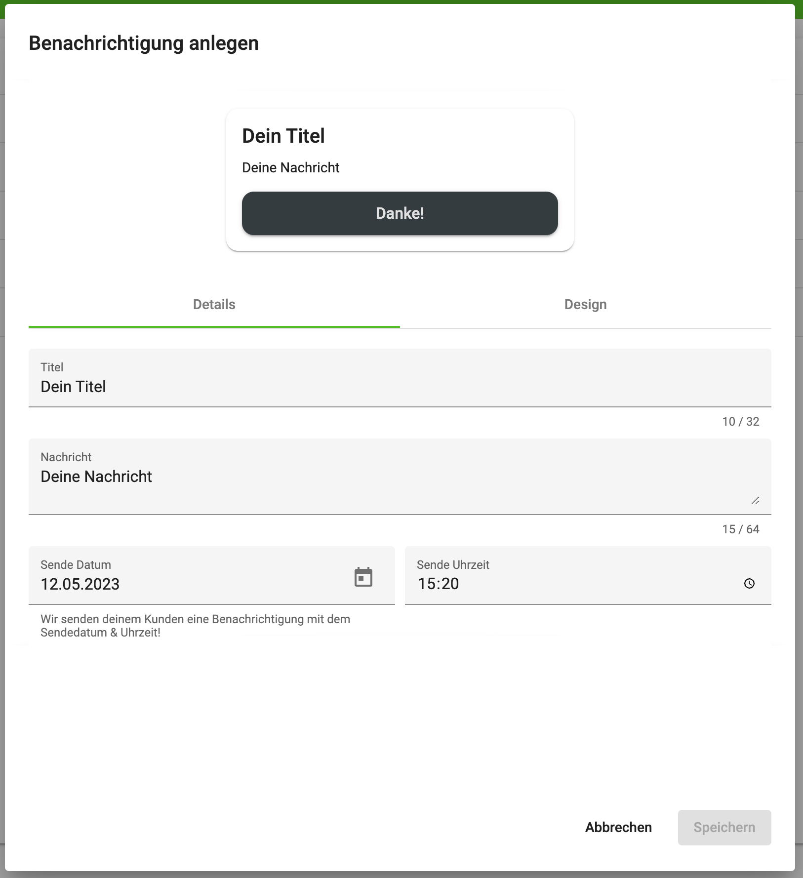
In the upper third of the dialog you see a live preview of the notification you will send to your customers. The dialog is structured in 2 tabs.
Details
Details: in the "Details" tab you can set the general settings for this notification. Here are the fields you can use:
-
Title: the title of the notification.
-
Message: the message that the user receives in the whitelabel app.
-
Send date and send time: here you specify when the customer should receive this notification.
Design
Design: in the "Design" tab you have the option to adjust the appearance of the notification by adding an image that is shown to the user.
Web Shop
In this section of Manager are all settings that can be used to configure the customer's web shop.
1. Web Shop Design
In the "Web Shop Design" menu item, you have the option to adjust the design of your web shop. We have developed a simple designer with which you can adjust the web shop design to your needs.
The following options are available:
-
Select venue: here you can select the desired venue to display a summary of orders for it. This field is only displayed if you have more than one venue in your account.
-
Surface selection: with this field you can view and select different shop surfaces to adjust the appearance of your web shop.
If you do not have a web shop module activated, you cannot use the web shop designer.
The web shop designer shows a design column on the left, with which you can adjust the design of the web shop. In the right column you see a non-clickable variant of the web shop. This changes its appearance as soon as you change the various available design elements.
With this button you can reset the design of your web shop to the default design.
By clicking the "Save design" button, your design is saved, but it is not yet shown in the web shop. This way you can continue to edit your design and only release it when the right moment comes.
By clicking the "Make design live" button, your design becomes visible to all users and is activated in the web shop.
2. Web Shop Settings
In the "Web Shop Design" menu item, you have the option to adjust the behaviour of your web shop. The settings of the web shop for the individual venues are controlled by the following filter.
-
Select venue: here you can select the desired venue to display a summary of orders for it. This field is only displayed if you have more than one venue in your account.
The following settings are available to adjust your web shop:
-
Web Shop URL: in this field you see the URL of your web shop.
-
URL Name: via this field you can change the URL. Note that changing the URL is a potentially risky action. If you change the URL without informing your customers, they will not be able to find the web shop. All existing QR codes of the web shop become invalid.
-
Anonymous dine-in guest order: for orders of type "On premise", the queries for login and guest user are not shown.
-
Show newsletter: the newsletter is shown for all order types; it is an opt-in field. This means the user must explicitly consent before we can store the user's email address.
-
Skip app landing page: if the customer also has a whitelabel app, QR codes for web orders first lead to the download page of the whitelabel app. With this setting, this behaviour can be disabled.
-
Embed web shop as widget: here you learn how to integrate the web shop directly into your website.
-
Enable table selection: for orders on premise, the table coded in the QR code is not used. Instead, the user sees a query and must enter their table number manually. This setting is needed when the customer does not have or does not want to use table identifiers.
-
Read-only mode: with this setting, the web shop can be configured so that the user cannot place orders, but can still see the available articles.