
This document explains how to style your bessa webshop yourself — colours, fonts and the individual surfaces. Unlike the whitelabel app, you don't deliver any files to us here; you set everything directly in the Manager and see each change immediately in a live preview.
You'll find the page in the Manager under Webshop → Design.
Two steps to go live. Every change first appears in the preview only. Design speichern (Save design) stores your work as a draft; Live schalten (Go live) publishes it to the real webshop your guests see. Only Go live changes what your customers actually see.
At a glance: what you can configure
The webshop design is made up of two fonts and several colour groups:
Fonts
-
Main font — used for all body text
-
Variant font — optional second font for headings and logos
Colour groups
-
Primary colours — your brand colour for the header and main buttons
-
Secondary colours — accent colour for secondary actions (e.g. "Checkout")
-
Surfaces & text — backgrounds, cards and the text colours on them
-
Borders & interactive elements — lines, dividers, disabled fields
-
Status colours — notices, warnings and error messages
-
Payment surface — colour of the Stripe payment form
Every colour has a sensible default. So you can set just the primary colour to match your brand and leave everything else — or fine-tune each surface individually.
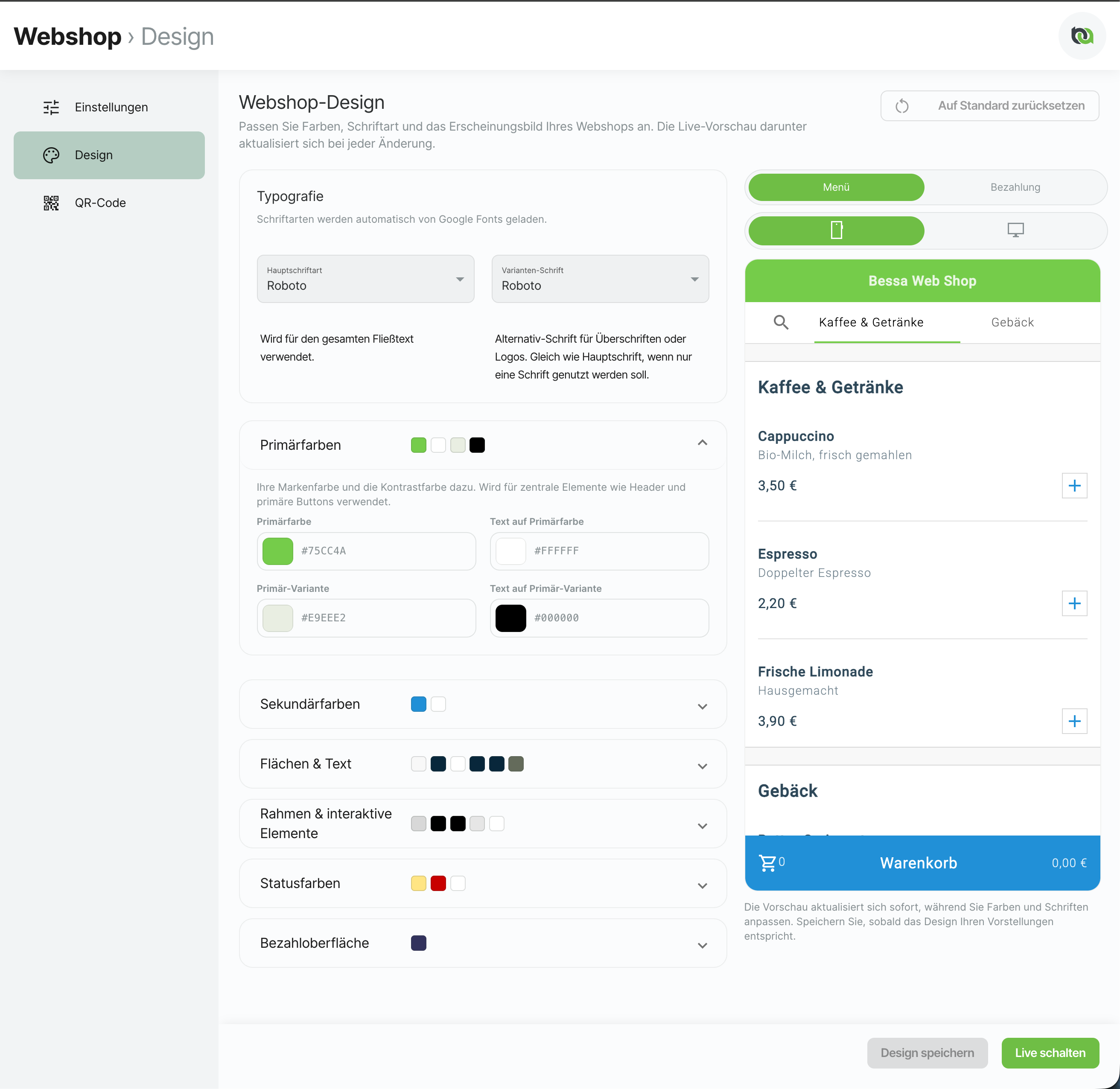
How the page works
Live preview
On the right (or below the settings on narrow screens) a real preview of your shop runs live. It updates instantly as you change colours and fonts — you don't need to save anything to see a change.
The preview has two toggles:
-
Menu / Checkout — shows either the menu with the shopping cart or the payment and confirmation step, so you can check both key screens.
-
Mobile / Desktop — switches between the smartphone view and full desktop width. The desktop preview appears at full width below the settings.
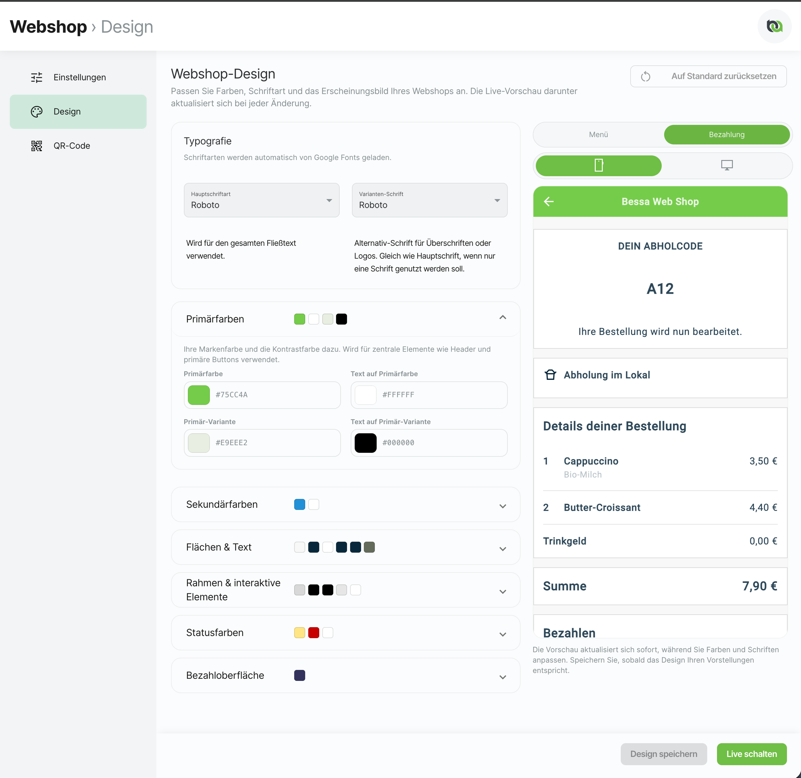
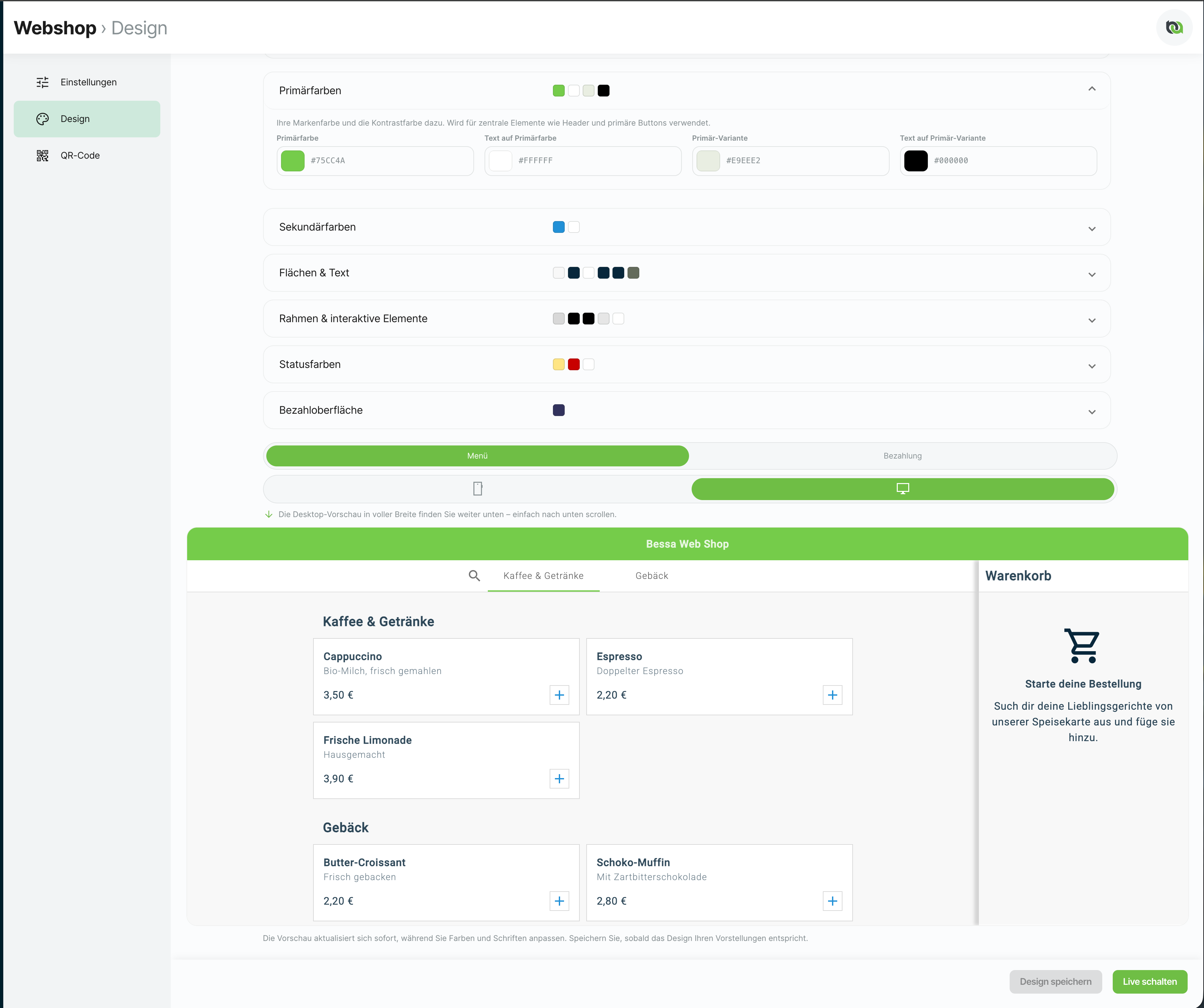
If a "preview not available" notice appears instead of the preview, first set the webshop URL on the Settings tab.
Saving and going live
-
Design speichern (Save design) stores your current state as a draft. The real webshop does not change yet — so you can keep working and continue later.
-
Live schalten (Go live) publishes the saved design to the real webshop. From that moment your guests see the new colours.
-
Auf Standard zurücksetzen (Reset to defaults, top right) resets all colours and fonts to the bessa defaults. You still need to save or go live afterwards for the reset to take effect.
After going live, some customers only see the change after a full page reload (Ctrl + Shift + R or Cmd + Shift + R), because their browser cached the old design file.
Design tips
Many colours come in pairs: a surface colour and the text colour on it (e.g. "Primary colour" and "Text on primary colour"). Always make sure these two have enough contrast with each other — otherwise text on buttons or cards becomes unreadable.
-
Strong contrast for the "Text on …" colours. For body text, aim for a contrast ratio of at least 4.5:1. You can check this with the WebAIM Contrast Checker.
-
Primary colour = your brand colour. It drives the header and the most important buttons and shapes the first impression. Choose it deliberately.
-
Make the secondary colour clearly distinct from the primary. It marks secondary actions such as "Checkout" and focus states in forms. If it's too similar to the primary, the distinction is lost.
-
Keep status colours recognisable. Warning (yellow/amber) and error (red) are signal colours — don't alter them too much or notices get overlooked.
-
Fonts come from Google Fonts. Both fonts load automatically; nothing to install. If you want to use a single font, simply set the main and variant fonts to the same value.
1. Typography
Fonts are loaded automatically from Google Fonts.
|
Field |
Default |
Used for |
|---|---|---|
|
Main font |
|
All body text in the shop |
|
Variant font |
|
Second font for headings or logos. Same as the main font if you only want one font. |
Available choices include Roboto, Open Sans, Lato, Montserrat, Inter, Nunito, Poppins, Source Sans Pro, Raleway, Playfair Display and Bitter.
2. Colours in detail
Each colour is picked via a colour swatch, with its hex value shown below. The following breakdown explains what each colour controls in the shop.
Primary colours
Your brand colour and its contrast colour. Used for central elements such as the header and primary buttons.
|
Field |
Default |
Controls |
|---|---|---|
|
Primary colour |
|
Main buttons, header bar, active tabs, category headers, selection and loading elements |
|
Text on primary |
|
Text and icons on primary-coloured surfaces (e.g. main button labels) |
|
Primary variant |
|
Lighter variant for set-apart areas such as category bars |
|
Text on primary variant |
|
Text on primary-variant surfaces |
Secondary colours
Accent colour for secondary actions (e.g. the "Checkout" button) and highlights.
|
Field |
Default |
Controls |
|---|---|---|
|
Secondary colour |
|
Secondary buttons (e.g. "Checkout"), focus states in form fields, highlights |
|
Text on secondary |
|
Text on secondary-coloured buttons and surfaces |
Surfaces & text
Background and surface colours plus their associated text colours.
|
Field |
Default |
Controls |
|---|---|---|
|
Page background |
|
Background of the whole shop page and of dialogs |
|
Text on background |
|
Text directly on the page background |
|
Card/surface colour |
|
Background of cards, tiles and dialog content |
|
Text on surface |
|
Main text on cards and surfaces |
|
Secondary text |
|
Supporting and helper text (e.g. article descriptions) |
|
Icon colour on surface |
|
Icons placed on cards/surfaces |
Borders & interactive elements
Border lines, dividers and states for disabled fields.
|
Field |
Default |
Controls |
|---|---|---|
|
Border |
|
Outlines of input fields and secondary buttons |
|
Divider |
|
Separator and section lines |
|
Selection/hover |
|
Highlight when an element is tapped or hovered |
|
Disabled (background) |
|
Background of non-clickable (disabled) fields and buttons |
|
Disabled (text) |
|
Text on disabled elements |
Status colours
Colours for notices, warnings and error messages.
|
Field |
Default |
Controls |
|---|---|---|
|
Warning |
|
Background of notice and warning messages |
|
Error |
|
Error messages and invalid input fields |
|
Text on error |
|
Text on error/warning-coloured surfaces |
Payment surface
Colours for the Stripe payment form.
|
Field |
Default |
Controls |
|---|---|---|
|
Stripe input text |
|
Text colour of the input fields in the Stripe card form |
Defaults at a glance
If you ever want to return to a starting point, here are all the defaults (the same ones that Reset to defaults restores):
|
Group |
Field |
Default |
|---|---|---|
|
Typography |
Main font |
|
|
Typography |
Variant font |
|
|
Primary |
Primary colour |
|
|
Primary |
Text on primary |
|
|
Primary |
Primary variant |
|
|
Primary |
Text on primary variant |
|
|
Secondary |
Secondary colour |
|
|
Secondary |
Text on secondary |
|
|
Surfaces |
Page background |
|
|
Surfaces |
Text on background |
|
|
Surfaces |
Card/surface colour |
|
|
Surfaces |
Text on surface |
|
|
Surfaces |
Secondary text |
|
|
Surfaces |
Icon colour on surface |
|
|
Borders |
Border |
|
|
Borders |
Divider |
|
|
Borders |
Selection/hover |
|
|
Borders |
Disabled (background) |
|
|
Borders |
Disabled (text) |
|
|
Status |
Warning |
|
|
Status |
Error |
|
|
Status |
Text on error |
|
|
Payment |
Stripe input text |
|
What you don't configure here
So it's clear what this page covers and what it doesn't:
-
Layout and structure of the shop (arrangement of menu, cart, steps)
-
Your articles, prices and categories — you maintain these in their respective places in the Manager
-
Product images — you add these on the individual article
-
The available fonts — a fixed selection of Google Fonts is offered
Related topics
-
Set Up Web Orders — embed the webshop as a widget or standalone page and make the remaining settings
Questions or anything unclear? Write to us at support@bessa.app. We're happy to help with colour decisions or an initial design proposal.